A product market fit scorecard: The definitive guide to track SaaS growth
Tired of running your SaaS on gut feelings and wishful thinking? Let's talk about product-market fit (PMF). It's that elusive sweet spot where you've built something people genuinely need and are willing to pay for. But for too many founders, it's just a vague concept. A PMF scorecard changes that.
Think of it as a diagnostic tool for your business. It pulls together all the critical signals—customer retention, satisfaction scores, user feedback, and engagement rates—into one clear, objective picture. This isn't about chasing vanity metrics; it's about building a data-driven system to guide your decisions, get your team aligned, and set the stage for real, scalable growth. As the authority on SaaS operations, we'll provide the exact next steps you can take to implement this in your business.
Stop Guessing and Start Measuring PMF

Does it ever feel like you're flying blind, just hoping your product is hitting the mark? You're not alone. It's a common trap in the SaaS world to rely on intuition to tell you if you've found product-market fit. That’s a risky way to build a company.
It's time to swap that guesswork for a clear, actionable system. A PMF scorecard isn't just another dashboard to glance at; it's a core operational tool. The most successful SaaS operators live and breathe by this kind of data. Honestly, measuring PMF isn’t just a good idea—it’s the foundation for any kind of sustainable success.
Why a Scorecard Is a Must-Have
A PMF scorecard is what gets you from vague "feelings" about your product to cold, hard data. And that shift is everything. It's what stops you from scaling too early, blowing your budget on the wrong marketing channels, or spending months building features that nobody actually wants.
Look at what Rahul Vohra did with Superhuman. He didn't just cross his fingers and hope for PMF. He engineered it. By creating a system based on the Sean Ellis Test and meticulously segmenting user feedback, he systematically improved his product. This wasn't magic; it was a methodical process that took Superhuman's PMF score from a worrying 22% to a solid 58%. It’s a perfect example of what a structured approach can do.
The Problem with "Feeling" Your Way to Fit
Trusting your gut is one of the most common startup mistakes. A few ecstatic customers can easily create a false sense of security, making you think you've nailed it when you're really just hearing from a vocal minority. A product market fit scorecard is your reality check. It forces you to look at a balanced set of indicators, not just the feel-good stories.
"Product-market fit means being in a good market with a product that can satisfy that market." – Marc Andreessen
Marc Andreessen's famous quote highlights the two sides of the coin: you need a great product and a receptive market. A scorecard helps you measure both. It tracks metrics that show how happy your users are and whether the market is actually pulling your product in. It’s worth exploring how this idea applies more broadly by looking into the differences between business scorecards and dashboards.
What This Guide Will Do for You
Think of this guide as your playbook for building and using your own scorecard. We'll give you the exact next steps, step by step. We'll cover exactly how to:
- Pinpoint the right mix of qualitative and quantitative metrics for your business.
- Actually build the scorecard using our free tool.
- Read the results and turn them into smart, decisive actions.
- Weave this scorecard into your weekly meetings and standard operating procedures.
To make this as practical as possible, we’ve built a free tool so you can follow along and create your own scorecard as you go. Grab our free product market fit scorecard tool and let's turn that PMF ambiguity into clarity.
Choosing the Right Metrics for Your PMF Scorecard
Your Product-Market Fit scorecard is only as good as the data you put into it. The secret isn't to track every metric under the sun, but to zero in on the handful that actually tell you if you're hitting the mark. The best way to do this is by splitting your metrics into two camps: leading and lagging indicators.
Think of it this way: leading indicators are like looking at the road ahead, giving you clues about what's coming. They're often qualitative. Lagging indicators are like looking in the rearview mirror—they're the hard, quantitative numbers that tell you what’s already happened. You absolutely need both to get the full story.
Leading Indicators: The Sean Ellis Test
When we talk about leading indicators, one method has truly stood the test of time: the Sean Ellis Test.
You've probably heard of it. Back in 2008, growth guru Sean Ellis came up with a brilliantly simple question to ask users: "How would you feel if you could no longer use the product?"
His research found a magic number. Companies where at least 40% of users answered 'very disappointed' were the ones that had what it takes to scale. This single question cuts through the noise and measures real-world dependency.
This isn't just some old-school theory; it's a battle-tested playbook. Rahul Vohra famously used this survey to drag Superhuman to product-market fit. He didn't just look at the 40% score. He obsessed over the users who said they'd be 'very disappointed' to understand what they loved, and then he doubled down on those features. Next, he went to the 'somewhat disappointed' group and used their feedback to systematically turn them into superfans.
Your actionable next step: Don't just measure the score. Dig into the why behind the numbers. Segment your responses and use the qualitative feedback from your most passionate users to steer your product roadmap.
Lagging Indicators: The Quantitative Truth
While leading indicators give you a glimpse into the future, lagging indicators ground you in reality. These are the cold, hard numbers that prove your product is actually delivering value and keeping users around. They are your source of truth.
Here are the essentials for your scorecard:
- Customer Retention Rate: This is the big one. It’s the percentage of customers who stick with you over time. High retention is the clearest sign that you've built something genuinely sticky that people can't live without.
- Net Promoter Score (NPS): A simple question—"How likely are you to recommend our product?"—packs a huge punch. NPS is a powerful signal of customer delight and a great predictor of future word-of-mouth growth.
- Activation Rate: This tracks how many new users actually experience your product's "aha!" moment. A low activation rate is a major red flag, telling you that either your onboarding is confusing or your core value isn't obvious enough.
It’s crucial to look at these metrics together. For instance, a sky-high NPS paired with a terrible retention rate is a classic warning sign. It means people love the idea of your product, but for whatever reason, it's not becoming a part of their daily routine. That kind of context is what turns raw data into powerful insights.
For a more exhaustive list, you can check out our detailed guide on the most important SaaS KPIs to track for growth.
To bring this all together, here’s a quick look at how these different indicators fit into your PMF scorecard.
Leading vs Lagging PMF Indicators
| Indicator Type | Metric | What It Measures | Example SaaS Tool |
|---|---|---|---|
| Leading | Sean Ellis Test | Customer dependency and emotional connection to the product. | SurveyMonkey |
| Leading | Qualitative Feedback | The 'why' behind user behavior and satisfaction levels. | Dovetail |
| Lagging | Retention Rate | The product's ability to provide long-term, sustained value. | ChartMogul |
| Lagging | Activation Rate | The effectiveness of onboarding and initial user experience. | Mixpanel |
| Lagging | Net Promoter Score | Overall customer loyalty and potential for word-of-mouth growth. | Delighted |
Ultimately, building an effective product market fit scorecard isn't about creating the world's biggest dashboard. It's about choosing a smart, balanced mix of metrics that give you an honest, 360-degree view of where you truly stand.
Building Your First Product-Market Fit Scorecard
Alright, let's move from theory to execution. It’s time to build the scorecard that will quickly become a central part of your SaaS operations. Don't worry, this isn't about creating some overly complex, intimidating dashboard. The goal is a simple, powerful tool that gives you immediate clarity on where you stand.
To make this as easy as possible, we built a free, interactive tool you can use right now. You don't need to be a data wizard to get started. Just plug in your numbers and see what they tell you.
Fire up our free Product-Market Fit Scorecard tool and you can build your scorecard as you follow along with this guide.
Defining Your Scorecard Columns
First thing's first: let's set up the structure. Think of your scorecard as a simple grid with a few essential columns for each metric you’ve decided to track (like Retention, NPS, and your Sean Ellis score).
For every single metric, you'll want columns for:
- Metric Name: What are we looking at? (e.g., Annual Customer Retention)
- Current Value: The real, hard number from your data.
- Target Value: What does 'good' actually look like for your stage?
- PMF Signal: This is your gut-check rating based on thresholds (Weak, Good, Strong).
- Trend: Is this number getting better, worse, or staying flat?
- Owner: Who on the team owns this number?
This simple setup keeps everything clean and, most importantly, accountable. It’s not just about the number itself; it's about the context, the direction it's heading, and who's on the hook for improving it. If you'd rather build this from scratch, our guide on creating a scorecard format in Excel has a few more templates you can borrow from.
Setting Clear Thresholds
This is the part that brings your scorecard to life. A number like "75% retention" is totally meaningless without context. You have to define what a Weak, Good, or Strong signal actually means for your business.
These thresholds aren't one-size-fits-all. They'll change depending on your industry, who you sell to (B2B vs. B2C), and your price point. But, to get you started, here’s a solid baseline for a typical B2B SaaS company:
- Annual Customer Retention:
- Strong: >80%
- Good: 60-80%
- Weak: <60%
- Sean Ellis Test ("Very Disappointed"):
- Strong: >40%
- Good: 25-40%
- Weak: <25%
- NPS Score:
- Strong: >50
- Good: 20-50
- Weak: <20
This visualization shows you exactly how to blend those squishy qualitative feelings with the hard quantitative data to get the full story.
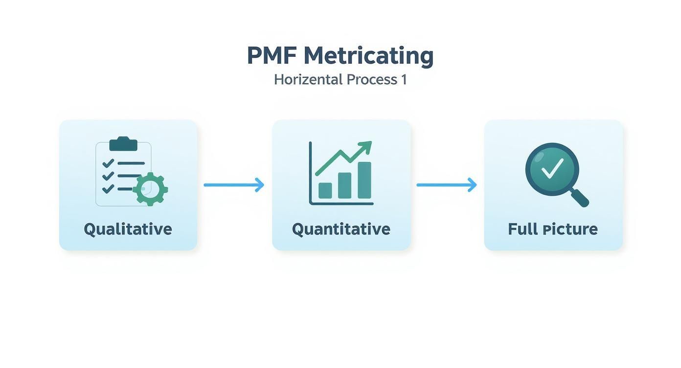
You can see how flowing from surveys to hard data gives you a much more holistic view, which stops you from getting obsessed with just one type of signal.
Your actionable next step: Don't just set these thresholds and forget them. As your company grows, your definition of 'Strong' has to evolve. What’s amazing for a seed-stage startup is probably just table stakes for a company at Series B. Make a habit of revisiting these every six months.
Populating Your Scorecard with Real Data
Now it's time to pull in the actual numbers. This is where the rubber meets the road. You’ll probably need to grab data from a few different places to get the complete picture.
- Quantitative Metrics: For things like retention and activation rates, you'll be pulling from your analytics tools (think Mixpanel or Amplitude) or straight from your billing system (like Stripe or ChartMogul).
- Qualitative Metrics: For NPS and the Sean Ellis Test, that data lives in your survey platform (e.g., SurveyMonkey, Delighted) or maybe even your CRM.
Once you start plugging in your data, our scorecard tool will look something like this.
See how it instantly turns those raw numbers into clear 'Weak', 'Good', or 'Strong' signals? That gives you an immediate health check without having to squint at a spreadsheet.
Weighting Metrics for Your Business Model
Here's an actionable insight a lot of teams forget: not all metrics carry the same weight.
If you’re running a high-touch, enterprise B2B SaaS, annual retention is probably your north star. It’s the ultimate proof that you’re solving a mission-critical problem for businesses that are in it for the long haul.
But for a B2C app with a freemium model, the activation rate and the Sean Ellis score might be far more important. They need to show that a huge volume of users can find value right away, even if long-term retention is naturally a bit lower. The data doesn't lie: B2B and B2C companies with over 80% retention are 4 times more likely to see revenue growth over 30% year-over-year.
Your actionable next step: Sit down with your team and have an honest discussion. Figure out which one or two metrics represent the ultimate truth for your business model, and give them a heavier weight in your overall PMF score. This makes sure your scorecard is actually telling you what matters for your unique path to success.
How to Read Your Scorecard and Take Action
Alright, you've put in the hard work to build your product-market fit scorecard. You've got the metrics, set the thresholds, and now the numbers are staring you right in the face. So, what's next?
A scorecard is pretty useless until you learn how to read the story it's telling. This is where the real magic happens—turning raw data into decisive action.
https://www.youtube.com/embed/oHjnngOBaqM
Don't just glance at the final score and label it "good" or "bad." Think of your scorecard less like a final grade and more like a diagnostic tool from a master mechanic. Its true value is in showing you the subtle relationships between different metrics, helping you pinpoint the exact source of friction in your growth engine.
What to Do When the Signals Get Crossed
One of the first things you'll probably notice is that your metrics rarely sing in perfect harmony. It’s totally normal to see conflicting signals, and honestly, these little mismatches are often where your biggest opportunities are hiding.
Let’s walk through a classic SaaS scenario: your Net Promoter Score (NPS) is sky-high, but your customer retention is in the gutter. What's that about? It's a huge clue that people love your product in theory, but for some reason, they aren't able to weave it into their daily lives. This practically screams that you have a broken onboarding process or you’re failing to get users to that initial "aha!" moment.
Here’s another one I see all the time: a fantastic Sean Ellis score but a dismal activation rate. This tells you your value prop is hitting home with a core group of users—they get it and would be lost without you. But brand new users are hitting a brick wall right after signing up. The promise of your product is there, but the first-mile experience is letting them down. Boom. Your scorecard just handed you your top priority on a silver platter.
A Simple Framework for Taking Action
Once you start spotting these patterns, you need a clear way to decide what to do next. Your scorecard results will almost always point you toward one of three strategic paths. Your job is to figure out which one you’re on.
-
Go Full Throttle: Are all your key metrics lighting up green in the "Strong" category? If so, this is your signal to hit the accelerator. Stop fiddling with minor product tweaks and shift your focus to aggressively scaling your go-to-market machine.
-
Fix the Leaky Bucket: Maybe you have one or two metrics in the "Weak" zone that are dragging down an otherwise healthy-looking scorecard. That’s a classic "leaky bucket" problem. It's time to pause any big new projects and rally the team to plug that specific hole, whether that means improving retention, redesigning your onboarding, or just making your value prop crystal clear.
-
Time for a Hard Reset: If most of your metrics are consistently stuck in the "Weak" zone, that's a tough pill to swallow. It points to a fundamental mismatch between what you've built and what the market actually wants. This is the hardest scenario, demanding a brutally honest look at your core assumptions and, quite possibly, a major strategic pivot.
A scorecard isn't just about measurement; it's about forcing difficult but necessary conversations. The data removes emotion and opinion, allowing your team to rally around solving the right problems.
The Special Role of NPS in Your Analysis
There's a reason the Net Promoter Score has become a go-to metric for gauging product-market fit—there’s a mountain of data proving it works. For instance, a 2021 study by Bain & Company found that companies with an NPS above 50 are 2.3 times more likely to outgrow their competitors.
And it doesn't stop there. A follow-up analysis in 2023 looked at over 1,200 tech firms and found that those with a strong NPS (over 50) saw an average annual growth of 22%. Compare that to just 8% for companies with an NPS below 30.
These numbers show why a strong NPS is such a powerful lagging indicator. If your other metrics look a bit weak but your NPS is solid, it gives you the confidence to invest in fixing the user experience because you know there's a loyal, enthusiastic customer base waiting for you on the other side.
Of course, scorecards are just one piece of a bigger puzzle. They often fit into a wider strategy that includes a full suite of business intelligence scorecards.
Ultimately, reading your product market fit scorecard is a continuous cycle of diagnosis, action, and iteration. It’s about looking past the individual numbers to see the connections between them. This is how you turn a simple tracking sheet into a powerful operational playbook for building a SaaS business that lasts.
Making the Scorecard Part of Your Company Rhythm

Let's be honest: a scorecard that just sits in a folder is nothing more than a fancy spreadsheet. If you want this product market fit scorecard to be a real game-changer, you have to weave it into the very fabric of your company's day-to-day. It can't be a one-off project. It needs to become a living, breathing part of how you operate.
This is the jump from just tracking PMF to actively managing it. The whole point is to make the scorecard a central talking point that drives real accountability and gets everyone marching in the same direction.
Weave It Into Your Meeting Cadence
The fastest way to give your scorecard teeth is to make it a mandatory agenda item in your key meetings. Seriously, don't let it become an afterthought you rush through in the last two minutes. It needs its own dedicated slot for a real discussion.
This has to start at the top, with your leadership team. The PMF scorecard should be a standing topic in every monthly business review, where you connect the dots between how the product is doing and how the business is performing. If you need a solid framework for these meetings, our monthly business review template can help you integrate this scorecard discussion smoothly.
Here’s a simple but effective playbook for reviewing the scorecard:
- Hit the Numbers: The metric owner gives a quick rundown of the current score, the trend over the last 90 days, and anything that jumps out.
- Tell the Story: This is where the magic happens. Go beyond the data. What’s the narrative? Why did retention slip last month? What amazing customer feedback is behind that killer NPS score?
- Assign Actions: The discussion needs to end with clear, owner-driven action items. Something like, "Okay, Sarah is going to dig into that activation rate drop and report back at the next product sync."
This simple loop turns your scorecard from a static report into a catalyst for action.
Define Who Owns What
If you want the scorecard to stay relevant and up-to-date, you need some simple Standard Operating Procedures (SOPs). Ambiguity is the enemy of execution. Everyone has to know exactly who is responsible for what and when it’s due.
A scorecard without owners is just a list of wishes. When you assign accountability to each metric, you ensure someone is always thinking about how to move that needle.
Your SOP can be dead simple. Just outline:
- Who owns each metric? Maybe the Head of Product owns the Sean Ellis Test, while the Head of Customer Success is on the hook for retention and NPS.
- How often is the data updated? Lagging indicators like retention are probably fine monthly, but leading survey data might get a quarterly refresh.
- Where's the single source of truth? Pinpoint the exact report or dashboard where the official number lives. No more "my numbers say this" arguments.
This level of clarity gets rid of excuses and makes sure the data you’re discussing is always fresh and reliable.
Automate the Data Flow to Keep It Alive
Let’s face it, manually updating a spreadsheet every month is a recipe for disaster. It’s tedious, easy to mess up, and it’s the first thing that gets dropped when things get crazy. To make this whole thing sustainable, you have to automate as much of the data collection as you can.
Think of it as building a data pipeline that feeds directly into your scorecard. You don't need a team of engineers for this; tools like Zapier or Make.com are perfect. You can set up simple workflows to pull data automatically from your core systems.
- Connect your CRM (like HubSpot) to grab customer health scores.
- Integrate your analytics platform (like Mixpanel) to pull in the latest activation and engagement rates.
- Link your survey tools (like Delighted) to pipe in fresh NPS and Sean Ellis scores.
Automating this doesn't just save a ton of time; it makes your data more trustworthy. When the numbers are pulled by a machine, they become the objective truth everyone can rally around. Integrating this kind of live data aligns perfectly with the principles of agile development, which champions continuous feedback and quick adaptation—something a dynamic scorecard supports beautifully.
Got Questions About Your Product Market Fit Scorecard?
So, you're ready to build your PMF scorecard. That's awesome. But once the spreadsheet is made, the real work begins. Living with it day-to-day is a whole different ballgame, and it always brings up some practical questions.
Let’s tackle some of the most common things we hear from SaaS founders and operators who are getting their hands dirty with this process. These are the "in the trenches" details that make your scorecard a living, breathing part of how you run the business.
How Often Should I Be Updating This Thing?
This is, without a doubt, the question I get asked most. The answer? It depends. Don't fall into the trap of thinking you need to update every single metric every single week. That's a fast track to burnout and, honestly, the data won't even be that useful.
The best approach is to match the update cadence to how quickly a metric can realistically move.
- Monthly is your sweet spot for the big, lagging indicators. Things like Customer Retention Rate and Net Promoter Score (NPS) don't change overnight. Looking at them monthly gives you a clear signal of the trend without all the noise.
- Quarterly works great for your survey-based, leading indicators. Think of the Sean Ellis Test. You can't spam your users with the same survey every month—they'll tune you out. A quarterly pulse check is perfect for getting a solid reading without causing survey fatigue.
What If I Barely Have Any Data for a Metric?
Ah, the classic early-stage dilemma. You want to track churn, but you only have 15 customers. You're trying to get a solid NPS score, but you've got maybe 20 active users. First off, don't panic. And whatever you do, don't just make up numbers to fill in the blanks.
When you're still in the early days, your scorecard is naturally going to lean more on the qualitative side of things. That's perfectly fine. Instead of chasing a formal NPS, dive deep into one-on-one customer interviews. Instead of obsessing over a tiny retention cohort, look at the engagement and session frequency of your handful of power users.
At the pre-product-market fit stage, your scorecard is about being directionally correct, not statistically perfect. Work with the data you have, and just be honest about where it's a little thin.
Your scorecard will grow up with your company. As your user base expands and the data gets richer, you'll naturally shift to a more balanced mix of qualitative and quantitative signals. The important thing is just to get started.
Help! My Metrics Are Telling Me Different Things.
It's actually pretty rare for every single metric to be green and pointing up. In fact, when your signals conflict, that's often where the gold is hiding. Let’s say your Sean Ellis score is looking great, but your retention numbers are in the tank. What gives?
This doesn't mean your scorecard is broken—it means it's doing its job perfectly. It’s shining a spotlight on a very specific problem. In this case, it's screaming that your value prop is hitting home with a certain group, but something is getting in the way of long-term stickiness. Maybe the onboarding is confusing, a key feature is buried, or the UI is just clunky.
When you spot conflicting signals, here is your playbook:
- Isolate the friction: The scorecard tells you what's happening, but it's your job to find out why.
- Talk to your users: Go find the people who are churning and hear their stories. What did they expect? Where did they get stuck?
- Form a hypothesis: Based on that feedback, you can come up with a clear idea to test, like, "We think users are leaving because our key reporting feature is too hard to find."
- Test and measure: Run an experiment to see if you're right. Then, watch your scorecard to see if you moved the needle.
Conflicting data isn't a failure. It's a roadmap pointing you to exactly what you need to fix next. It's how you go from building features on a hunch to solving problems with real evidence.
Here at SaaS Operations, we're all about using clear, data-driven playbooks to find the fastest path to growth. Our templates, including the one for the Product Market Fit Scorecard, are built to give you the exact, actionable steps to run a smarter business. Ready to stop guessing? Grab our free Product Market Fit Scorecard Tool and start measuring what matters.