SaaS KPIs: Your Complete Guide to Growth-Driving Metrics
Understanding The SaaS Metrics Universe
Traditional business metrics, which often center on one-time sales and immediate profits, don’t fit the subscription-based world of SaaS. It’s like trying to navigate a submarine with a car’s GPS; the tools are built for a completely different environment. In a SaaS business, revenue isn’t a single event but a continuous stream, making the old financial playbook obsolete. This is where SaaS KPIs come in, acting not just as a rearview mirror but as a sophisticated early-warning system.
These indicators do more than just report on what happened last quarter; they offer predictive insights into the health and direction of your business. Founders who master these metrics can often spot potential problems months before they become crises. For instance, a small dip in a product engagement metric might seem minor, but it could be the first sign of a user experience issue that leads to major churn three months down the road. By catching it early, you can step in before it affects your revenue.
The Hierarchy of SaaS KPIs
Not all SaaS KPIs are created equal, nor do they all need the same level of attention. Smart operators learn to group metrics based on their strategic importance and how often they need to be checked. Think of it as a pyramid:
- Daily Pulse Checks: These are your leading indicators, like new trial signups or daily active users (DAU). They give you instant feedback on marketing campaigns and product engagement.
- Weekly Trend Analysis: Metrics such as lead velocity rate or activation rates are ideal for weekly reviews. They reveal the momentum of your growth engine without getting lost in daily noise.
- Monthly Deep Dives: This is where you analyze lagging indicators like Monthly Recurring Revenue (MRR) and Customer Churn. These metrics tell the story of your company’s financial health and long-term sustainability.
The real power of SaaS KPIs is unlocked when you stop seeing them as isolated data points and start connecting them into a single story. For example, the diagram below shows the basic SaaS model, where a service is hosted centrally and delivered to customers through a subscription.
This model’s reliance on recurring payments is exactly why metrics like churn and customer lifetime value are so important for long-term success. A high number of signups means very little if those users don’t stick around. Creating a metric hierarchy helps every team—from marketing to product—understand how their daily actions contribute to the company’s main goals. By linking these numbers, you create a complete picture of your company’s performance. To put this into practice, you can learn how to build an effective KPI scorecard that operationally connects these metrics.
Revenue Metrics That Actually Drive Decisions
While a high-level view of your business is useful, revenue is where the rubber meets the road. Monitoring the right revenue metrics tells you whether you’re building a sustainable company or just running on fumes. These numbers form the foundation of your financial story, giving you the clarity needed for everything from board meetings to daily operational tweaks. Forget vanity metrics; these are the core SaaS KPIs that truly count.
This digital dashboard shows how different monthly revenue streams are tracked, offering a clear picture of financial health.
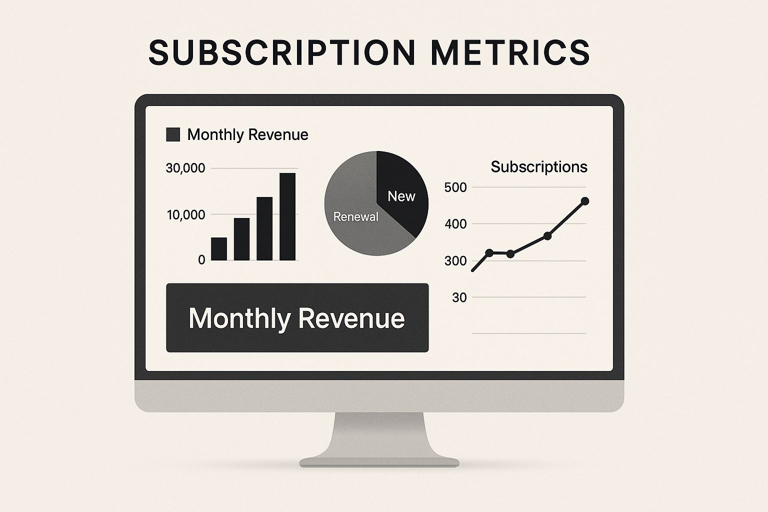
The key takeaway is that a single monthly revenue figure is actually a combination of new, expansion, and lost revenue. Each component tells a different part of your growth story.
The Bedrock of Subscription Revenue: MRR and ARR
Think of Monthly Recurring Revenue (MRR) as the steady, predictable heartbeat of your company. It’s the total recurring revenue you can reliably expect from all your customers each month. This isn’t just a static number; it’s a powerful tool for forecasting financial momentum.
Its annualized counterpart, Annual Recurring Revenue (ARR), is simply your MRR multiplied by 12. ARR is often the headline metric for SaaS companies focused on enterprise clients or those seeking investment, as it provides a longer-term perspective on financial stability.
Monthly Recurring Revenue (MRR) is one of the most foundational KPIs in the SaaS world. To calculate it, you multiply your number of customers by the average revenue per user (ARPU). For example, if a company has 1,000 customers each paying $50 per month, the MRR would be $50,000. These metrics are vital for judging business health, especially as the global SaaS market is expected to hit around $295 billion by 2025, with a 19.4% annual growth rate. You can find more on SaaS industry trends in this detailed statistical analysis.
However, a single MRR or ARR figure doesn’t give you the full picture. To make it actionable, you need to break it down:
- New MRR: Revenue generated from brand-new customers. This directly reflects the success of your sales and marketing campaigns.
- Expansion MRR: Extra revenue from existing customers who upgrade, add more users, or buy additional services. This is a strong indicator of product value and customer happiness.
- Churn MRR: Revenue lost from customers who cancel or downgrade their subscriptions.
Your Net New MRR (New MRR + Expansion MRR – Churn MRR) is the ultimate sign of your growth trajectory. A healthy SaaS business consistently shows positive Net New MRR.
Deeper Dives: ARPU and Net Revenue Retention
While MRR provides the big picture, Average Revenue Per User (ARPU)—sometimes called Average Revenue Per Account (ARPA)—gives you crucial per-unit insight. You calculate it by dividing your total MRR by your number of customers. ARPU helps you understand the value of a typical customer.
Tracking ARPU over time reveals important trends. If it’s rising, your efforts to upsell or attract higher-value clients are paying off. If it’s falling, you might be acquiring lower-value customers or facing pressure to offer downgrades. These insights are essential for refining your pricing strategy and understanding your SaaS sales funnel.
To help you keep these key metrics straight, here is a quick comparison table outlining their formulas, benchmarks, and primary uses.
| SaaS Revenue Metrics Comparison |
|---|
| A comprehensive comparison of key revenue metrics showing calculation methods, typical benchmarks, and strategic applications |
| Metric |
| MRR |
| ARR |
| ARPU/ARPA |
| NRR |
This table shows that while MRR and ARR track overall revenue, ARPU and NRR provide deeper insights into customer value and loyalty, which are critical for sustainable growth.
Beyond these, a more advanced metric that investors love is Net Revenue Retention (NRR). This KPI measures your ability to grow revenue from your existing customer base, accounting for both expansions and churn. An NRR over 100% means your expansion revenue outpaces the revenue you lose from churn—a powerful signal of a healthy, scalable business.
Essentially, an NRR above 100% shows that your company could keep growing even if you didn’t sign up a single new customer. This demonstrates incredible product value and customer loyalty, making it one of the most compelling SaaS KPIs for long-term success.
Mastering Customer Acquisition And Lifetime Value
Focusing only on boosting revenue can feel like progress, but it often masks deeper issues. It’s like trying to fill a bucket with a firehose while ignoring the giant holes in the bottom. Sustainable growth isn’t just about pouring more customers in; it’s about ensuring each one is profitable in the long run. This is where the crucial relationship between Customer Acquisition Cost (CAC) and Customer Lifetime Value (CLTV) comes into play, forming one of the most important duos in your set of SaaS KPIs.

The Economics of SaaS Growth: CAC and CLTV
Think of Customer Acquisition Cost (CAC) as the total price tag for winning a new customer. This isn’t just your ad spend; it includes all sales and marketing costs—from content creation and events to team salaries and commissions—divided by the number of new customers you brought in during that time. It’s the upfront investment you make for growth.
On the other side of this economic coin is Customer Lifetime Value (CLTV). This metric represents the total revenue you anticipate earning from a single customer over their entire time with your company. CLTV is the long-term prize, and the fundamental goal is simple: the prize (CLTV) must be much bigger than the price tag (CAC). If you spend $500 to acquire a customer who only brings in $300 over their lifetime, your business model has a serious flaw.
A healthy SaaS business hinges on the balance between these two metrics. If you spend $1 million on sales and marketing to acquire 2,000 new customers, your CAC is $500. You must then weigh this against the total revenue each customer is predicted to generate. Achieving a strong CLTV to CAC ratio is the key to profitable growth, a necessity in an industry expected to hit $793 billion by 2029. You can explore more SaaS statistics and benchmarks to understand how these metrics drive the market.
Beyond the 3:1 Ratio: A Deeper Look at Profitability
You’ve probably heard the common advice to aim for a CLTV:CAC ratio of 3:1 or better. This means for every dollar you spend to get a customer, you should expect to earn at least three dollars back. While this is a great starting point, it’s not a one-size-fits-all rule. Your ideal ratio depends on your specific business model and cash flow. A company with very low churn and high gross margins might thrive with a 2.5:1 ratio, whereas a business with higher operational costs might need a 4:1 ratio to stay healthy.
Another critical piece of the puzzle is the CAC Payback Period, which tells you how many months it takes to recoup the initial cost of acquiring a customer. Most high-performing SaaS companies aim to get their money back in under 12 months. A longer payback period can put a serious strain on your cash reserves, making it hard to reinvest in growth, even if your CLTV:CAC ratio looks good on paper.
This is where you need to go beyond surface-level averages. The most successful founders dissect these metrics using cohort analysis. By grouping customers who signed up in the same period (like the “January 2023 cohort”), you can track their behavior over time and uncover powerful insights:
- Do customers from a specific marketing campaign have a higher CLTV?
- Is the CAC payback period getting shorter or longer with your new pricing tiers?
- Which acquisition channels bring in the most loyal and profitable customers?
Answering these questions transforms you from someone who just tracks SaaS KPIs to a leader who uses them to build a more efficient and resilient business. Improving retention and finding ways to expand customer accounts are the best ways to boost your CLTV, a concept you can explore further by reading about effective customer success strategies.
Product Engagement KPIs That Predict Success
While revenue and acquisition metrics show if you can sell your product, engagement metrics tell you if you’ve built something people truly want to use. This is where the real value of your service is tested every day. These specific SaaS KPIs are the leading indicators of long-term customer health, often predicting retention or churn long before financial reports can. Think of them as the pulse of your product; a strong, steady beat signifies a healthy user base.
The Story Beyond User Counts: DAU, MAU, and Stickiness
At first glance, metrics like Daily Active Users (DAU) and Monthly Active Users (MAU) seem straightforward. DAU counts the unique users who engage with your product on a specific day, while MAU does the same over a 30-day window. Their true power, however, isn’t in the raw numbers but in their relationship. The DAU/MAU ratio, often called the “stickiness ratio,” is a powerful indicator of value.
To calculate it, you simply divide your DAU by your MAU. If you have 2,000 daily active users and 10,000 monthly active users, your stickiness ratio is 20%. This suggests the average user comes back to your product on six out of 30 days. For a tool built for daily use, like a project management app, a ratio above 20% is a great signal. For a reporting tool used less often, a lower ratio might be perfectly acceptable. The key is defining what “active” means for your product. Is a login enough, or must a user perform a critical action to be counted?
Moving from Usage to Value: Feature Adoption and Time-to-Value
Knowing people are logging in is good, but understanding what they are doing is much better. This is where the feature adoption rate becomes a critical product KPI. It measures the percentage of users who are actively using a particular feature. Imagine you release a new AI-powered analytics tool. If only 5% of your active users try it, you either have a marketing issue or the feature isn’t solving a real problem.
Leading product-led companies focus heavily on this metric. They use it to:
- Validate the product roadmap: High adoption of a new feature confirms it was a worthy investment.
- Identify power users: Individuals who adopt multiple key features are often your most loyal advocates and ideal candidates for upsells.
- Improve onboarding: Low adoption of core features can signal that your onboarding flow isn’t guiding new users to that “aha!” moment.
This leads directly to Time-to-Value (TTV), which tracks how long it takes a new user to see the benefit of your product. A shorter TTV is almost always better. When a user experiences a tangible benefit in their first session, they are far more likely to convert from a trial and remain a customer. Companies that excel here map out the essential user journey, pinpoint friction, and constantly refine their onboarding to speed up value delivery. These product engagement SaaS KPIs don’t just track activity; they measure the delivery of your core promise to the customer.
To put these ideas into context, the following table provides some general benchmarks for user engagement KPIs. Keep in mind that these numbers can vary widely based on your specific product, industry, and customer profile.
| Metric | Early Stage | Growth Stage | Mature Stage | Industry Average |
|---|---|---|---|---|
| DAU/MAU Ratio (Stickiness) | 10-15% | 15-25% | >25% | ~20% |
| Feature Adoption Rate (Core Features) | >30% | >40% | >50% | ~40% |
| Time-to-Value (TTV) | < 1 hour | < 30 minutes | < 15 minutes | Varies Greatly |
| Session Duration | 5-10 mins | 10-15 mins | >15 mins | ~12 mins |
As the table shows, expectations for engagement metrics evolve as a company grows. An early-stage startup might be happy with a 10% stickiness ratio, while a mature, market-leading product should aim for 25% or higher. The goal is continuous improvement, using these benchmarks as a guide rather than a strict rulebook.
Financial Health Metrics Beyond Revenue
Revenue growth is exciting, but it only tells part of the story. True sustainability in the SaaS world is found in financial health metrics that dig deeper, showing whether your growth is efficient or just an expensive habit. These are the SaaS KPIs that smart investors and board members focus on because they predict long-term stability, not just a temporary spike in sales.

The True Cost of Your Service: Gross Margin
Your Gross Margin reveals how much profit you make on your core service after subtracting the direct costs of delivering it. Think of it like a coffee shop: if your revenue is the price of a coffee, your gross margin is what’s left after paying for the beans, cup, and milk. These direct costs, or Cost of Goods Sold (COGS), typically include:
- Hosting and infrastructure fees
- Third-party software licenses embedded in your product
- Salaries for your customer support and implementation teams
A strong SaaS company usually aims for a gross margin of 80% or higher. If your margin is low or shrinking, it could be a warning sign that hosting costs are getting out of hand or your support team is stretched too thin. This metric helps you understand your product’s core profitability before you even spend a dollar on sales or marketing.
Cash Flow: The Lifeblood of Your Operations
For a SaaS business, cash flow is more complex than just revenue minus expenses. When cash comes in and goes out is critical. Two essential metrics to watch are Net Burn Rate and Runway.
Net Burn Rate is the net amount of money your company loses each month. For instance, if you start the month with $100,000 in the bank and end with $80,000, your net burn rate is $20,000. This number is like a speedometer for your cash, showing how fast you’re using your capital.
Your Runway is calculated by dividing your total cash reserves by your net burn rate. With $200,000 in the bank and a $20,000 burn rate, you have a runway of 10 months. This tells you how long you can operate before running out of money. It’s a direct measure of your strategic freedom—a long runway gives you time to grow, while a short one forces tough choices. Proper financial management is key to building a resilient company, a subject covered in detail in guides on SaaS operations management.
Unpacking Your Profitability: Unit Economics
While gross margin gives a high-level picture, unit economics breaks down profitability to the individual customer level. This is where you link financial health directly to your customer acquisition and retention efforts. The objective is to make sure that the lifetime value (LTV) of a customer is much higher than the cost to acquire them (CAC).
To see this in action, imagine you have two acquisition channels:
| Unit Economics by Acquisition Channel |
|---|
| Example analysis of profitability per customer for two different marketing channels. |
| Metric |
| CAC |
| ARPA |
| Avg. Customer Lifetime |
| LTV |
| LTV:CAC Ratio |
In this scenario, both channels attract customers with the same monthly revenue. However, Channel B is clearly more profitable over time. Its customers stick around longer and cost less to acquire, leading to a much better LTV:CAC ratio. Analyzing these financial SaaS KPIs is crucial for directing your resources wisely and building a business that grows profitably.
Sales And Marketing Performance Optimization
Your go-to-market engine, which is made up of your sales and marketing teams, requires regular tuning to perform at its best. Think of yourself as a race car engineer; you need the right set of instruments to know exactly which levers to pull for more speed and power. For a SaaS business, these instruments are your sales and marketing SaaS KPIs. They give you a clear view of the entire customer journey, from a curious visitor to a loyal, paying customer.
From First Click to Closed Deal
The customer journey is often visualized as a funnel, and making it better means tracking conversions at every single stage. The process kicks off with marketing’s ability to attract the right people and turn them into leads. From that point, the baton is passed between teams, and each handoff is a critical point to measure.
- Marketing Qualified Leads (MQLs): These are people who have shown some initial interest, like downloading an ebook or signing up for a webinar. This is the marketing team’s way of saying, “This person looks like they could be a good fit.” The average MQL to SQL conversion rate hovers around 13%, but this can differ greatly by industry and company.
- Sales Qualified Leads (SQLs): This is where the sales team agrees with marketing’s initial judgment. An SQL is a lead that has been reviewed and is considered ready for a direct sales conversation. A low MQL-to-SQL conversion rate often points to a misalignment between sales and marketing on what a “good lead” actually is.
This dashboard from Salesforce shows how different sales KPIs, like win rate and sales cycle length, are monitored.
The chart highlights that tracking metrics such as the average sales cycle by representative can uncover coaching opportunities and bottlenecks in the process. The ultimate conversion is from an SQL to a closed-won customer. Tracking the win rate—the percentage of SQLs that become paying customers—tells you how effective your sales process and product offering truly are.
Optimizing Your Sales Engine
Beyond the conversion funnel, two key metrics determine how efficient your sales team is: Sales Cycle Length and Deal Velocity. Sales cycle length measures the average time it takes to close a deal, from the first contact to a signed contract. For SaaS companies, the average sales cycle is about 84 days. A long cycle can eat up resources and push back revenue.
Deal velocity, on the other hand, measures how quickly deals are moving through your sales pipeline. By looking at these metrics across different customer segments or deal sizes, you can find hidden patterns. For instance, you might discover that deals from a specific marketing channel close 20% faster, which suggests that channel is delivering higher-quality leads. This is where marketing attribution models are essential, as they help you see which channels give you the best return on investment.
True performance optimization is more than just looking at surface-level numbers. It’s about creating a clear operational framework that connects marketing spending to sales results. To get there, companies need to grow in their operational maturity, a journey we cover in our guide to the SaaS maturity model. By consistently watching these sales and marketing SaaS KPIs, you can fine-tune your go-to-market strategy for predictable and scalable growth.
Building Your Actionable KPI Dashboard
Collecting data on your SaaS KPIs is one thing; turning that data into confident decisions is a completely different challenge. A great KPI dashboard should act as your company’s mission control, showing the right information at the right time to guide your strategy. It’s not just about tracking numbers—it’s about creating a living tool that clearly communicates the health and momentum of your business. Without this, even the most accurate metrics can become an expensive distraction.
The first step is to sidestep the common pitfall of creating a “data graveyard”—a dashboard cluttered with every metric imaginable. Instead, build your dashboard with a clear purpose, focusing on a balanced set of indicators that tell a complete story.
Selecting Your Core Indicators
A powerful dashboard balances two types of metrics:
- Leading Indicators: Think of these as your early-warning system. They are forward-looking metrics that help predict future outcomes. Examples include trial sign-up rates, lead velocity, and product activation rates. A spike in trial sign-ups this week often points to an increase in new MRR next month.
- Lagging Indicators: These metrics measure past performance and confirm long-term trends, like MRR, customer churn, and Customer Lifetime Value (CLTV). They tell you whether your past strategies were successful.
For example, an executive dashboard might focus on high-level lagging indicators like Net New MRR and the LTV:CAC ratio. In contrast, a marketing team’s dashboard would lean into leading indicators like MQLs generated and visitor-to-lead conversion rates. The key is to tailor the view to the audience, making sure every team understands how their daily actions influence the company’s bigger goals.
Designing for Action and Accountability
Once you’ve picked your KPIs, the design of your dashboard is crucial for making them actionable. Structure your dashboards to create clear accountability across different departments. A well-designed system doesn’t just show data; it sparks questions and drives strategic conversations. For instance, if Expansion MRR is below target, the dashboard should make it easy to drill down into related metrics like feature adoption rates or NPS scores from high-value accounts.
By automating these tracking systems, you can get rid of tedious manual work and ensure data is always accurate. This frees up your team to focus on what truly matters: analyzing the insights and taking action to drive growth.
Ready to build a data-driven culture with actionable scorecards and automated processes? At SaaS Operations, we provide battle-tested playbooks and templates to help you translate your SaaS KPIs into effective business operations. Accelerate your growth today.