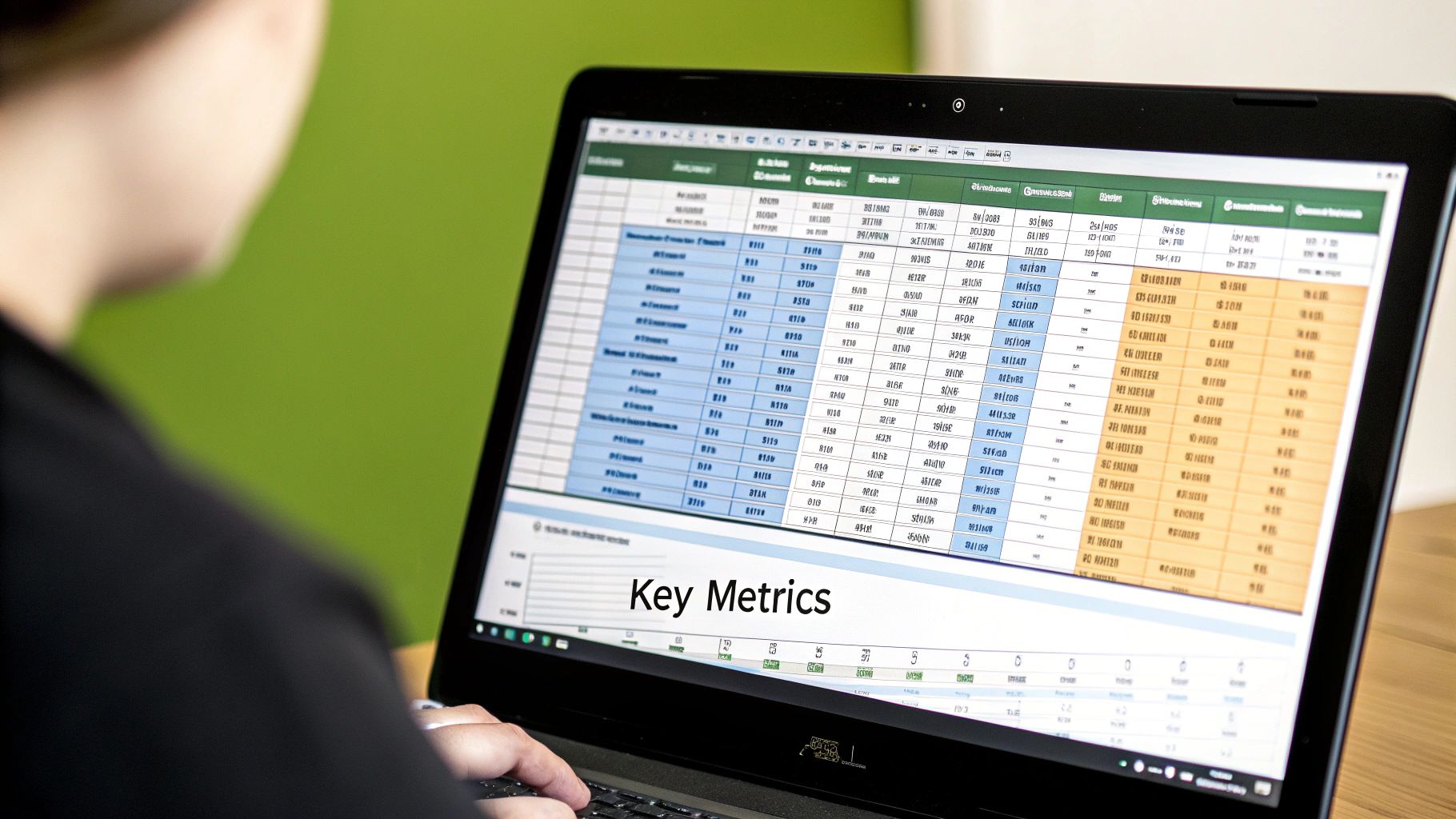
A truly great scorecard isn’t just a pile of raw data. It’s a living document that connects that data to your actual performance targets, using simple visual cues to tell you exactly how you’re doing at a single glance. When done right in Excel, you can track weekly inputs, see them roll up into month-to-date figures, and instantly compare that progress against your monthly goals.
Why Excel Is a Surprisingly Powerful Tool for Your Scorecard

Before you jump to expensive, specialized software, take a look at the powerful tool you almost certainly already have: Microsoft Excel. For a lot of teams, especially when they’re just starting out with formal performance tracking, Excel is the perfect place to build a scorecard. It’s flexible, everyone has it, and most people already know how to use it. Think of it less like a simple spreadsheet and more like a dynamic dashboard that can get your entire team aligned and making smarter decisions.
There’s a good reason Excel has been a go-to for this kind of thing for years, ever since the Balanced Scorecard concept first gained traction. Its universal accessibility has made it a cornerstone of strategic management. A quick search for free templates online proves just how globally recognized it is for building out strategy and tracking performance.
A well-built scorecard in Excel needs a few key elements to be truly effective. It’s more than just dropping numbers into cells; it’s about creating a clear, at-a-glance story of your performance.
Core Components of an Effective Excel Scorecard
| Component | Purpose | Example |
|---|---|---|
| KPIs/Metrics | The specific “what” you are measuring. | Monthly Recurring Revenue (MRR), Customer Churn Rate |
| Targets/Goals | The desired outcome for each KPI. | Achieve $50,000 in new MRR, Keep churn below 2% |
| Actuals | The real-time or historical data for each KPI. | Current new MRR is $20,000, Churn is at 2.5% |
| Visual Indicators | Color-coding (like RAG) for instant status checks. | Red, Yellow, Green cells based on performance |
| Pacing Calculation | A formula to show if you’re on track to meet the goal. | (Actuals / Target) vs. (% of Month Passed) |
These components work together to transform a static sheet into a dynamic tool that guides decisions and keeps everyone on the same page.
The Power of Seeing Red (and Yellow, and Green)
One of Excel’s biggest strengths for scorecards is its ability to give you an immediate visual read on performance. The most common and effective way to do this is with a simple Red-Yellow-Green scoring system. This system tells you if you are on track or off track instantly.
- Green: All good! You’re on track or even ahead of your target.
- Yellow: A heads-up. You’re falling a bit behind and should pay attention.
- Red: This is a clear warning sign. You’re significantly off track and action is needed now.
This kind of color-coding turns a boring wall of numbers into a clear, actionable story. A quick scan is all it takes to see where you need to focus your team’s energy. You can see some fantastic balanced business scorecard examples to get ideas for your own design.
By using a simple green, yellow, red status, you remove ambiguity. Everyone on the team instantly knows if a metric is healthy or needs immediate intervention, fostering accountability and proactive problem-solving.
Are We on Pace to Win?
Beyond just showing if a number is good or bad right now, a truly useful Excel scorecard tells you about your pacing. Pacing answers the most important question for any in-progress goal: “Based on how many days have passed in the month, are we actually on track to hit our target?”
For example, let’s say you’re 50% of the way through the month. To be perfectly on pace, you should be at 50% of your monthly goal. If you’re only at 25%, your scorecard should light up in red or yellow. It’s a warning that even though the absolute number might look okay today, you’re falling behind schedule. This gives you a chance to make corrections mid-month instead of finding out you missed the mark when it’s already too late.
Building Your Scorecard Foundation
A great scorecard doesn’t need to be complicated. In fact, the most powerful ones I’ve seen start with a simple, logical structure. This is the foundation that makes your scorecard not just a bunch of numbers, but a tool your entire team can actually use and understand. Let’s build out the skeleton of a solid scorecard format in Excel, one that effectively tracks performance from weekly inputs all the way to your monthly goals.
First thing’s first: let’s set up the columns. Open a fresh Excel sheet and create headers for the information that matters most. A really effective setup I’ve used for years includes:
- KPI: The specific metric, like “New MRR” or “Website Traffic.”
- KPI Owner: Who’s on the hook for this number? Accountability is key.
- Monthly Target: What’s the goal for the entire month?
- Week 1, Week 2, Week 3, Week 4: The spaces for your weekly data entry.
- Month Actuals: A column to automatically sum up the weekly numbers.
This simple layout gives you a granular, week-by-week view of performance while keeping the big monthly picture front and center.
Here’s a pro-tip that will save you a ton of headaches: Freeze your top row and your first couple of columns (KPI and KPI Owner). This way, your headers and metric names stay put as you scroll, which is a lifesaver when you’re deep in the data.
From Weekly Data to a Monthly Story
With your columns ready, the real work begins. Each week, you’ll manually plug the numbers for each KPI into the right column. The “Month Actuals” column is where a little Excel magic comes in—just use a basic SUM formula to add the weekly columns. This gives you an instant, up-to-date total.
This roll-up from weekly inputs to a month-to-date figure is the core of a good scorecard. It clearly shows how the grind of each week contributes to hitting (or missing) that big monthly number.
The Simple Power of Red, Yellow, Green
Now that you have targets and actuals, you can add a simple visual system to quickly see how you’re doing. You don’t need fancy charts to start; a basic green, yellow, and red color scheme is incredibly effective for getting the story at a glance.
- Green: All good. You’re hitting or beating your target.
- Yellow: Getting close, but you’re a bit behind where you need to be.
- Red: Warning! You’re significantly off track and something needs to change.
This color-coding, which we’ll automate with formulas later on, stops you from having to squint at every single number. Your eyes are immediately drawn to the red and yellow areas that need your attention. Understanding which metrics to even include is a science in itself. To learn more, check out our guide on the relationship between a KPI and a scorecard.
Understanding Your Pacing
Finally, a truly smart scorecard format in Excel tells you more than just where you are; it tells you if you’re moving fast enough. This is pacing. It’s the answer to the all-important question: “Are we going to make it?”
Think about it this way: if you’re 15 days into a 30-day month, you’re 50% of the way through the calendar. So, you should be at roughly 50% of your monthly target. If your “Month Actuals” show you’re only at 30% of the goal, you’re behind pace. Calculating this helps you spot trouble early and gives you time to course-correct, turning your scorecard from a backward-looking report into a proactive tool for managing the business.
Making Your Scorecard Smart with Formulas
A well-organized spreadsheet is a great starting point, but let’s be honest, it’s still just a collection of static numbers. The magic happens when we make it intelligent. We’ll use a few simple formulas to transform your data into a living, breathing dashboard that tells you what’s going on at a glance.
The first and most fundamental step is to get your weekly data to automatically add up into a month-to-date total. This is where the SUM function in Excel becomes your best friend. In your “Month Actuals” column, you’ll just add up the cells for Week 1, Week 2, Week 3, and Week 4. It’s a simple formula, but it means that every time you punch in the latest weekly numbers, your monthly total updates in real-time.
Key Takeaway: You don’t need to be an Excel wizard. The goal is to use basic, reliable functions to automate the boring stuff. This frees you up to think about what the numbers actually mean for the business.
Adding a Red, Yellow, Green Scoring System
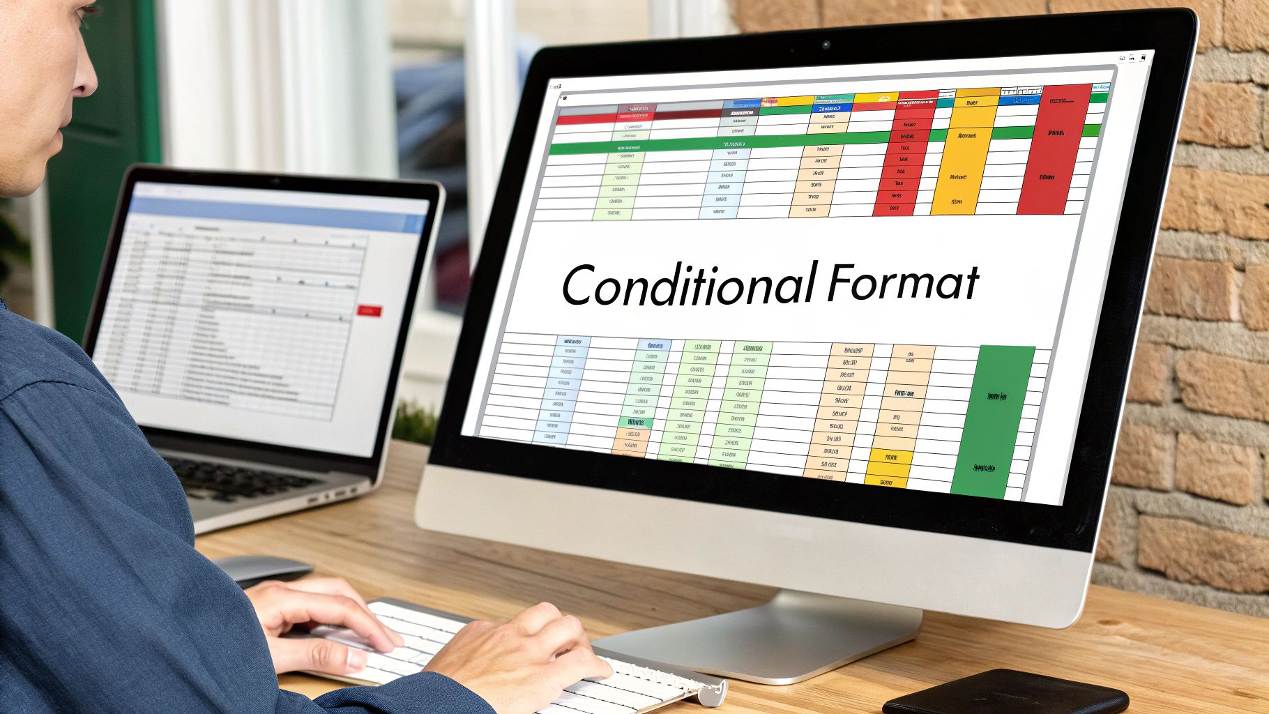
This is where your scorecard really starts to shine. By adding a simple color-coded system—often called RAG (Red-Yellow-Green)—you create instant visual cues about performance. Anyone can look at it and know exactly where things stand. The best part? You can do this without writing a single line of complex code by using Conditional Formatting.
Let’s say you’ve set some performance targets. You could set up rules like this:
- Green: Performance hits 95% or more of the target. Great job!
- Yellow: Performance is hovering between 75% and 94% of the target. This is a warning sign.
- Red: Performance has dropped below 75% of the target. Time to investigate.
This simple visual trick elevates your scorecard from a basic data tracker to a powerful management tool. The infographic below lays out the general flow for getting your scorecard ready for these dynamic elements.
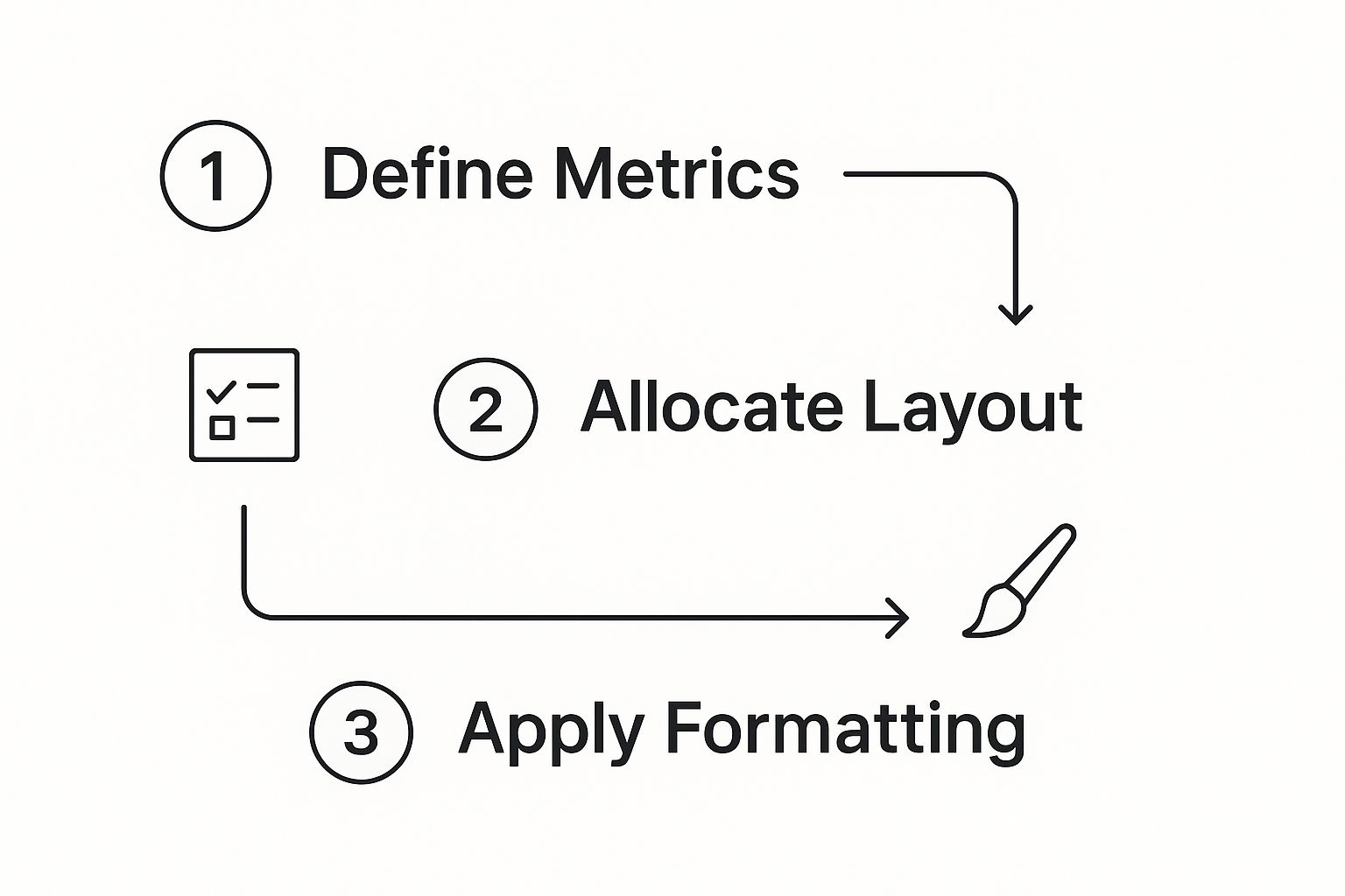
As you can see, applying this kind of dynamic formatting is the final, crucial step that brings everything together once your metrics and layout are in place.
Calculating Your Pacing to Stay Ahead
A truly great scorecard doesn’t just report history; it helps predict the future. This is where pacing comes in. Pacing answers a critical question: “Are we on track to hit our goal by the end of the month?”
It’s a simple comparison of your progress against the time that’s already passed. For example, if you’re 15 days into a 30-day month, 50% of your time is gone. To be “on pace,” your “Month Actuals” should be at least 50% of your “Monthly Target.” If you’re only at 30% of your target halfway through the month, you know your pacing is off, and that RAG indicator should probably be flashing yellow or red.
This calculation is a lifesaver because it spots problems early, giving you a chance to make adjustments before it’s too late. If you want to get more familiar with the kinds of metrics that are perfect for this, our guide on essential SaaS KPIs is an excellent resource.
Bringing Your Scorecard to Life with Pacing and Visuals
A scorecard that just lists targets and actuals is a rearview mirror—it tells you where you’ve been. A truly useful scorecard format in Excel needs to be a GPS, telling you if you’re on the right path to hit your destination. That’s where pacing comes in.
Pacing turns your static report into a living, breathing tool. It moves you from simply reporting what happened to actively managing what’s about to happen.
At its core, pacing answers one crucial question: “Are we on track to hit our monthly goal right now?” It does this by comparing your progress against the target to how much of the month has already passed. This simple calculation is your early warning system.
How to Calculate Pacing
The formula itself is pretty straightforward. You first need to figure out what percentage of the month is over. Then, you compare that to the percentage of the goal you’ve achieved.
Let’s say you’re halfway through a 30-day month—it’s the 15th, so 50% of the time is gone.
- Ahead of the game: You’ve generated 60% of your target for new leads. You’re crushing it.
- Right on track: You’ve hit exactly 50% of your goal. The pace is perfect.
- Falling behind: You’re only at 25% of your lead target. Houston, we have a pacing problem.
This is the kind of proactive insight that separates great teams from good ones. You get a chance to see a problem emerging and fix it mid-month, instead of doing a post-mortem on a missed goal when it’s too late.
Turning Numbers into a Clear Story with Red-Yellow-Green Status
This is where the classic Red-Yellow-Green system shines. By tying your pacing calculation to conditional formatting, you can make your scorecard tell a story at a glance. No one needs to squint at the raw numbers.
Your Red-Yellow-Green status should be a direct reflection of your pacing. “Green” doesn’t just mean a number is big; it means you are on track or ahead of where you need to be today to win the month. This shifts the team’s focus from “Where are we?” to “Are we going to make it?”
A manager can look at the scorecard and instantly spot the wins (green), the areas that need a gentle nudge (yellow), and the metrics that are on fire (red).
Visualize Your Momentum with Sparklines
While pacing gives you a snapshot of your current trajectory, sparklines add a layer of historical context right inside a single cell. I’ve always found them to be one of Excel’s most powerful and underused dashboard features. They show you the week-by-week trend without cluttering up your sheet with bulky charts.
Is a metric on a steady incline? Or was there a big spike last week after a slump? A sparkline tells you this instantly.
Adding one is incredibly easy:
- Click the cell where you want the sparkline to live.
- Head to the “Insert” tab and find the Sparklines group. I usually prefer “Line” for trends or “Column” for volume.
- For the “Data Range,” just select your weekly data cells (e.g., the values for Week 1, Week 2, Week 3, and Week 4).
This idea of providing continuous, actionable feedback is what makes modern performance tools so effective. For example, the Microsoft Adoption Score uses daily updates over a 28-day window to show how teams are using M365. You can see how Microsoft visualizes these usage trends for inspiration. By adding sparklines to your scorecard format in Excel, you’re bringing that same level of dynamic, visual insight to your own KPIs.
Turning Your Scorecard Into a Team Habit
Let’s be honest: a beautifully crafted scorecard format in Excel is just a file collecting digital dust until your team actually uses it. To make it a cornerstone of your operations, it needs to become a trusted, weekly habit. The real goal here is to transform that spreadsheet into your team’s single source of truth for performance—the place where productive conversations begin.
First things first, you need a simple, reliable rhythm for updates. Assign every single KPI to an “owner” who’s responsible for plugging in their numbers by a set time each week. For example, make it a standing deadline: every Monday by noon, no exceptions. This small bit of process creates accountability and guarantees your scorecard is always fresh.
To keep the data clean, lean on Excel’s Data Validation tool for your weekly input cells. It’s a lifesaver for preventing simple typos, like someone typing “N/A” when a zero is needed, which can easily break your formulas.
Protect Your Formulas, Spark Great Conversations
Once your scorecard is up and running, your next job is to protect its engine. One accidental drag-and-drop or a mistaken key press can wreck your carefully built formulas.
I always recommend highlighting all the cells with your core logic—things like your “Month Actuals” sums or pacing calculations—and then using Excel’s Protect Sheet feature. This lets you lock down the important stuff while leaving the data entry columns open for the KPI owners. It’s the perfect balance of security and usability.
With a reliable and protected scorecard, you can shift your focus from reporting the numbers to discussing them. The scorecard should drive your meetings, not just be a background slide. Instead of having people read their numbers off the screen, start asking what’s behind them.
The best team meetings I’ve been in use the scorecard as a launchpad. When a metric turns red, the conversation isn’t, “What’s the number?” It’s, “What’s our plan to get this green again?” This simple shift turns a passive report-out into an active problem-solving session.
Focus on Pacing with a Simple Red-Yellow-Green Status
Your weekly chats get a whole lot sharper when you start talking about pacing. Pacing answers the most important question: are we on track to hit our monthly goal? If you’re 75% of the way through the month, you should be at or near 75% of your target. Simple as that.
This is where a classic green, yellow, red (RAG) scoring system really shines, especially when you tie it directly to that pacing metric.
Here’s how I think about it:
- Green: You’re on pace or ahead. Great work, keep it up.
- Yellow: You’re slipping a bit behind pace. This is your early warning sign to dig in.
- Red: You’re significantly off track. This needs immediate attention and an action plan, now.
This visual cue is incredibly powerful. It instantly draws everyone’s eyes to the problem areas, cutting through the noise of all the other numbers. It helps the team see the big picture at a glance.
This kind of disciplined, data-first meeting cadence is the same foundation you’d use for bigger, strategic check-ins. In fact, many of these same principles are essential for running a great QBR, which we cover in our guide for building a quarterly business review template. It all starts with trusted data.
Answering Your Scorecard Questions
As you start using your scorecard, you’ll naturally run into a few questions. Getting the details right is what transforms a simple spreadsheet into a powerful tool for your team. Let’s walk through some of the most common questions I hear from teams building these out for the first time.
How Should I Track Weekly vs. Monthly Data?
This is a big one. The cleanest way to set up your scorecard format in Excel is to give each week its own column (Week 1, Week 2, Week 3, and so on). Then, you’ll want a “Month Actuals” column right next to them. This column should simply sum the weekly inputs.
Doing it this way gives you an automatic, clean roll-up. You can instantly see how each week’s hustle contributes to the big picture and your monthly goal.
How Does the RAG System Actually Work with Targets?
The red, yellow, and green (RAG) status is all about getting a quick visual read on performance. It’s more than just pretty colors; it’s about tying those colors to concrete rules based on your monthly targets.
Here’s a simple, effective setup I’ve seen work time and again:
- Green: You’re hitting 95% or more of your target. Great job, you’re on track.
- Yellow: Performance is somewhere between 75% and 94% of the target. This is your heads-up—the metric needs a closer look.
- Red: Performance has dipped below 75%. Time to sound the alarm and take immediate action.
You can set these thresholds up in minutes using Excel’s Conditional Formatting feature. It allows anyone, even non-technical execs, to understand performance at a glance without having to dig into the raw numbers. This kind of instant feedback is a cornerstone of many successful customer success strategies because it helps teams spot and fix problems before they get out of hand.
What Exactly Is “Pacing” and Why Is It So Important?
Pacing might be the single most important calculation on your entire scorecard. Why? Because it answers the crucial question: “Based on our progress today, are we actually going to hit our goal by the end of the month?”
Think of it this way: If you’re halfway through the month (50% of the days have passed), you should have achieved roughly 50% of your monthly target to be considered “on pace.” If you’ve only hit 30% of your goal, you’re falling behind, even if the absolute number seems okay on its own.
This forward-looking perspective is what makes a scorecard a strategic asset rather than just a backward-looking report. It lets you see trouble brewing while there’s still time to do something about it.
When you combine pacing with your RAG status, your scorecard gets even smarter. A metric might turn red not because the current number is bad, but because your rate of progress is too slow to hit the finish line. That’s a much more intelligent way to view performance.
At SaaS Operations, we provide battle-tested playbooks and templates to help you build efficient systems, from scorecards to strategic planning. Stop reinventing the wheel and accelerate your growth with our proven frameworks. Learn more at https://saasoperations.com.