Before you can even think about building impressive business scorecards and dashboards, you need to lay the groundwork. This isn’t about jumping straight into a data visualization tool. It’s about first defining what success actually looks like for your business, and then making sure every single metric you track ladders up to that vision.
Building Your Data-Driven Foundation
I’ve seen it happen time and time again: companies treat scorecards and dashboards as a purely technical project. But the most effective ones are born from a clear business strategy, not just from whatever data is easiest to pull. If you skip the planning, you’ll end up with reports that look great but don’t drive any real decisions.
The whole point here is mastering the art of turning data into actionable insights. That journey starts with getting crystal clear on the roles these two powerful tools play in a SaaS company.
Scorecards vs. Dashboards: What’s the Difference?
People often use these terms interchangeably, but they serve very different functions. Think of it this way:
A business scorecard is strategic. It’s your high-level report card, showing progress against long-term goals like increasing market share or boosting customer lifetime value. You’re probably only looking at this monthly or quarterly to see if the ship is headed in the right direction.
A dashboard, on the other hand, is operational. It gives you a real-time or near-real-time pulse on day-to-day activities. This is what a sales team uses to track daily calls and deals, or what a support team watches to monitor ticket resolution times.
To help clarify, here’s a quick comparison of their purpose and how they’re used in a business.
Scorecard vs Dashboard Key Distinctions
A quick comparison to help you understand the purpose and application of each tool in a business context.
| Attribute | Business Scorecard | Business Dashboard |
|---|---|---|
| Purpose | Strategic oversight; tracks progress against long-term goals. | Operational awareness; monitors real-time or daily performance. |
| Focus | “Are we doing the right things?” | “Are we doing things right?” |
| Audience | Executive leadership, department heads. | Teams, individual contributors, managers. |
| Timeframe | Long-term (monthly, quarterly, annually). | Short-term (real-time, daily, weekly). |
| Example | Tracking quarterly churn rate against an annual goal. | Monitoring new support tickets opened in the last hour. |
This table should make the distinction clear. Scorecards are for steering the ship, and dashboards are for checking the engine room.
The infographic below also does a great job of breaking down the key distinctions between their purpose, update frequency, and format.
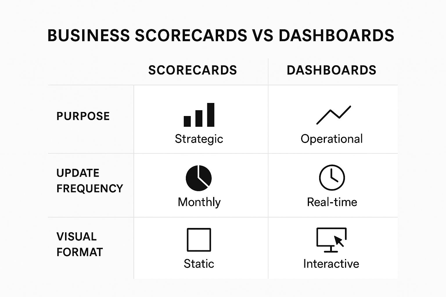
As the visual shows, one is for strategic oversight, while the other is all about immediate operational awareness.
Aligning with Core Business Goals
Your first real step is to get out and talk to key stakeholders across different departments. Don’t just ask them what charts they want. Instead, ask them about their core objectives. You’ll quickly find a VP of Sales is laser-focused on shortening the sales cycle, while the Head of Customer Success is obsessed with chipping away at the churn rate.
Your goal is to uncover the one or two metrics that truly define success for each team. This is how you avoid “vanity metrics”—like website traffic—that clutter your view and distract from what actually moves the needle.
This process ensures every visual you create is tied directly to a real business outcome. It’s no wonder the demand for these tools is exploding. The dashboard software market was valued at around $6 billion in 2024 and is expected to climb to $11.75 billion by 2029.
By building this strategic layer first, you create a measurement plan that becomes your blueprint. To go even deeper on this foundational work, you might want to check out our complete guide on https://saasoperations.com/business-intelligence-scorecards/. Taking the time to do this ensures every chart you build serves a clear purpose, guiding your team toward smarter, data-informed actions.
Choosing KPIs That Actually Matter

Here’s a hard truth: the line between a useful dashboard and a page of digital clutter is razor-thin. What makes the difference? The quality of your Key Performance Indicators (KPIs). It’s easy to fall into the trap of tracking popular, but often shallow, metrics like Monthly Recurring Revenue (MRR) or basic churn. But truly effective business scorecards and dashboards tell a story—and they do it by focusing on metrics that actually drive action.
The real goal is to find your leading indicators, the metrics that predict future success, not just the lagging indicators that tell you what already happened. Think of it this way: MRR tells you what you’ve already earned. But a metric like the product adoption rate for a crucial new feature can tell you a lot more about future revenue and customer loyalty.
Going Beyond the Obvious Metrics
Every team in your company has its own set of levers that push the business forward. A smart measurement strategy means digging into these specific areas to find the KPIs that genuinely matter for each one. It’s all about asking better questions.
For example, a marketing team could just track website traffic, but that’s a classic vanity metric. A far more insightful KPI would be the Marketing Qualified Lead (MQL) to Sales Qualified Lead (SQL) conversion rate. This number cuts right to the chase, showing how many marketing-generated leads are actually good enough for the sales team to pursue. It reveals the real impact of marketing on the bottom line.
Here are a few other real-world examples I’ve seen work well for different SaaS teams:
- For Sales: Instead of just counting total deals closed, track your Sales Cycle Length. A shorter cycle means your team is more efficient and you’re recognizing revenue faster. It’s a direct measure of operational health.
- For Customer Success: Don’t stop at simple churn rate. Monitor Net Revenue Retention (NRR). This powerful metric shows if your revenue from existing customers is actually growing through upsells and expansions, even after you account for lost customers.
- For Product: Forget just counting daily active users. Measure the Feature Adoption Rate for your most important functionalities. This tells you if you’re building things that customers genuinely value and use.
A study by the KPI Institute found that a staggering 68% of companies saw a positive jump in business performance after putting a real KPI strategy in place. The magic isn’t just in tracking stuff; it’s in choosing the right stuff to track.
The ‘Less is More’ Approach
One of the biggest mistakes I see teams make is dashboard-stuffing. When you cram 30 different charts onto one screen, it just becomes noise. Your team won’t know where to look, and the critical signals will get completely buried. The best dashboards are always ruthlessly curated.
For each department, try to zero in on 3-5 core KPIs that tell the most important part of their story. This forces a conversation about priorities and cuts out the distractions. A focused set of metrics makes it so much easier to spot trends, diagnose issues, and—just as importantly—celebrate the wins.
If you’re looking for a starting point to define your own metrics, it helps to see what others in the industry are tracking. You can find a whole host of ideas and learn how to pick the right ones in our detailed guide to SaaS KPIs.
By carefully selecting a handful of high-impact metrics for each team, you can turn your scorecards from passive reports into active guides. They become tools that don’t just display data, but point your team toward meaningful action and real, measurable growth.
Finding the Right Tools for the Job

Okay, you’ve figured out what success looks like and which KPIs you need to track. Now comes the fun part: picking the right platform to bring it all to life. The market for business intelligence (BI) tools is packed, and it’s incredibly easy to get dazzled by flashy demos and long feature lists.
The secret is to ignore the noise and focus on what your SaaS operations actually need. But before you even think about comparing vendors, you have to get your own data in order. There’s no point in plugging messy data into a shiny new tool—you’ll just get bad insights, faster.
A common pitfall I see is teams rushing to pick a tool before they have a solid data strategy. You absolutely must establish a single source of truth for each metric, whether that’s your CRM, billing system, or product analytics platform. Without that foundation, your dashboard is just a pretty picture built on quicksand.
Dedicated Platforms vs. Custom Builds
Your first major decision point is whether to go with an off-the-shelf BI platform or build something from scratch. For most SaaS companies, a dedicated platform like Tableau, Power BI, or Looker is the way to go. They come loaded with powerful features right out of the box.
- Dedicated Platforms: These tools live and breathe data visualization. They offer tons of integrations, are built to scale, and don’t require a team of developers to get up and running. The main downside can be the licensing costs, which add up over time.
- Custom-Built Solutions: Going custom gives you total control. You dictate the exact look, feel, and functionality. But this path demands serious developer resources, not just for the initial build but for all the maintenance and updates that follow.
As you explore your options, it’s worth checking out some of the leading no-code platforms as well. They can be a great middle ground, offering a lot of flexibility without needing deep coding expertise.
Key Factors for Choosing a Tool
To make a smart choice, you need to evaluate potential tools against a few core criteria. Don’t just look at the sticker price; think about the total investment of time, training, and resources.
Here’s what I recommend focusing on:
- Ease of Use: Can a non-technical person actually use it? If your marketing manager or head of sales has to file a ticket with a data analyst just to see a report, you’ve created a bottleneck, not a solution.
- Integration Capabilities: How well does it play with the tools you already use, like Salesforce, Stripe, or HubSpot? If it doesn’t connect smoothly, you’re signing up for manual data pulls, which defeats the whole purpose of automation.
- Scalability: Will this tool grow with your company? Think about how it will handle more data and more users a year or two from now.
The demand for these tools is exploding. The global business value dashboard market, which includes scorecards, was valued at around $5 billion in 2025 and is projected to hit nearly $15 billion by 2033. That growth is a clear signal: picking a tool that can support your long-term goals is more important than ever.
Designing Dashboards People Will Actually Use

Here’s a hard truth I’ve learned over the years: even the most powerful business dashboards are worthless if no one uses them. And they won’t use them if they can’t understand them at a glance. Good design isn’t about aesthetics; it’s about clarity. If your team has to spend ten minutes just figuring out what a chart is trying to say, you’ve failed.
The secret is to put your user first. Always. A dashboard for a sales team should practically scream “here are your priorities for today.” On the other hand, a dashboard for the C-suite needs to paint a high-level, strategic picture. Before you even think about charts and colors, ask yourself: Who is this for, and what’s the one key decision they need to make after seeing it?
Tell a Story with Your Layout
A well-designed dashboard guides the eye. Think like a newspaper editor and put the most critical headline news “above the fold”—meaning the top-left corner. This is where you want to place your 3-5 most important KPIs. They should provide an instant summary of business health.
From there, the layout should let people dig deeper if they need to. You want to structure the information to tell a story. Start with the “what” (like a sudden drop in user signups) and then use adjacent charts to explain the “why” (maybe website traffic from a key channel cratered). This approach transforms a jumble of data into a clear, actionable narrative.
The goal of a dashboard is not just to display data, but to guide the user to an insight as quickly as possible. Every element should serve this purpose. Clutter is the enemy of clarity.
Choose the Right Visual for the Job
Please, stop defaulting to pie charts for everything. They’re notoriously bad for comparing values, yet people use them all the time. The type of chart you pick can be the difference between instant understanding and complete confusion.
Here’s a simple cheat sheet I rely on:
- Line Charts: These are your best friend for showing trends over time. Think Monthly Recurring Revenue (MRR), daily active users, or churn rates.
- Bar Charts: Perfect for comparing distinct categories. Use them to see which marketing channel brings in the most qualified leads or to stack-rank sales rep performance.
- Big Numbers (Scorecards): Sometimes, you just need one number to stand out. For a critical KPI like total customers or current system uptime, just show the number. Big and bold.
- Heat Maps: Fantastic for visualizing complex data at a glance. A classic example is identifying the busiest hours for customer support tickets.
The goal is to pick a visual that makes the data’s point obvious without requiring a ten-minute investigation. To see this in action, it helps to check out real business intelligence dashboard examples that nail their layouts and metric choices.
A Common Pitfall: Before and After
I see this all the time. The “before” is a marketing dashboard cluttered with ten different pie charts, a rainbow of clashing colors, and zero visual hierarchy. It’s pure chaos. You don’t know where to look first.
Now, let’s fix it. The “after” version takes that same data and presents it with intention. The top left now shows three crucial numbers: New Leads, Conversion Rate, and Cost Per Lead. Below that, a single bar chart cleanly compares lead sources, while a line chart tracks the lead trend over the last 30 days. The color scheme is muted, using a single accent color to highlight something important, like when a metric drops below its target.
This simple makeover makes the dashboard scannable and, more importantly, actionable. If you’re looking for more proven layouts, our own collection of metrics dashboard examples can give you some battle-tested ideas. Focus on clarity, and you’ll create tools that actually empower your team instead of just overwhelming them.
Driving Adoption Across Your Organization
Let’s be honest. You can build the most technically perfect dashboard in the world, but it’s just a pretty picture if it sits there gathering digital dust. The real work—and where you’ll find the actual value—is getting your team to use it every day.
Successful adoption never happens by accident. You can’t just drop a link in Slack and expect everyone to suddenly change how they work. You have to treat this like a proper internal product launch. That means generating some buzz, showing people exactly how to use it, and proving its value from day one. Think of it as onboarding your team to their own data.
Fostering a Data-Driven Culture
The goal here is to shift conversations from “I think we should…” to “The data shows us that…”. This change has to start at the top. When leaders and managers pull up the business scorecards and dashboards to kick off their meetings, it sends a crystal-clear signal: this is how we make decisions now.
Weave these tools right into the fabric of your team’s routines:
- Weekly Team Meetings: Dedicate the first 5 minutes to a quick dashboard review. Talk about what the numbers mean, celebrate the wins, and figure out a plan for any metrics that are trending in the wrong direction.
- 1-on-1s: Use individual performance dashboards to ground your conversations in objective data. This makes discussions about progress and coaching so much more productive.
- Project Kickoffs: Look at historical data on your dashboards to set goals and benchmarks that are ambitious but still realistic.
Consistent exposure is everything. The more your team sees the dashboards being used to make real decisions, the more they’ll start to see them as essential.
Training and Continuous Improvement
A great rollout lives or dies by its training. And I don’t just mean a quick demo of what buttons to click. You need to teach your team how to read the stories the data is telling and connect those insights to their actual jobs. The same thinking that goes into a great customer onboarding experience applies here. In fact, our guide on SaaS onboarding best practices has some great takeaways you can steal for your internal training.
Keep your documentation simple and easy to find. A quick video walkthrough or a simple one-pager that explains each KPI in plain English can make all the difference. Ditch the technical jargon and focus on answering the “what’s in it for me?” question for every single user.
I’ve learned that overcoming resistance is just part of the game. The best way I’ve found to win over the skeptics is to find a specific, nagging problem they deal with and show them exactly how the dashboard solves it. Once they see it save them time or help them nail a target, they’ll become your biggest champions.
Finally, set up a clear and simple way for people to give feedback. A dedicated Slack channel or a basic form where users can ask questions, flag issues, or suggest improvements works wonders. This not only helps you make the dashboards better over time, but it also gives your team a real sense of ownership. When people feel like their voice is heard, they’re much more likely to get on board and help you build that data-driven culture you’re after.
Frequently Asked Questions
Even with a solid plan, you’re bound to have questions once you start building and using your new business scorecards and dashboards. Let’s walk through some of the most common ones that pop up after the initial excitement wears off.
Getting these details right is what separates a dashboard that gets used from one that gets ignored.
How Often Should We Update Our Business Dashboards?
This is a great question, and the honest answer is: it depends entirely on what the dashboard is for. There’s no magic number here.
- Operational Dashboards: Think of things that track the daily grind—a sales team’s lead board or a support team’s ticket queue. This data needs to be fresh to be useful, so you’ll want to update it daily, if not hourly.
- Strategic Scorecards: These track the big picture, long-term goals like customer lifetime value or market share. For these, a weekly, monthly, or even quarterly update cadence is perfectly fine. You’re looking for trends, not moment-to-moment changes.
What Is the Biggest Mistake to Avoid?
The most common trap I see teams fall into is information overload. It’s so tempting to cram every single metric onto one screen, but you just end up with visual chaos.
When a dashboard is too busy, it’s impossible to spot what actually matters. The critical insights get buried under a mountain of noise.
The best dashboards are ruthlessly focused. They tell a clear, simple story with a hand-picked set of essential KPIs, pointing you directly to what needs your attention.
Remember, a cluttered view is an ignored view. Less is almost always more.
Should Every Department Have Its Own Dashboard?
Absolutely. In fact, I’d say it’s essential. Every team has its own mission, so its data needs will naturally be different.
For example, your marketing team is obsessed with lead conversion rates and campaign ROI. Meanwhile, your customer success team lives and breathes metrics like churn rate and average ticket resolution time. Department-specific dashboards give everyone instant access to the numbers that directly impact their work.
These specialized dashboards can then roll up into a high-level executive view that summarizes performance across the company. This approach works incredibly well for review cycles. For a deeper dive, our guide on building a quarterly business review template ties in perfectly with this strategy.
How Can We Ensure Our Data Is Accurate?
If your team doesn’t trust the numbers, your dashboards are worthless. Building that trust is everything.
First, you need to establish a single source of truth for every metric. Decide where the official “MRR” or “New Customer” number comes from, document it, and stick to it. From there, set up automated data validation checks to flag errors before they cause problems.
Most importantly, document how each KPI is calculated so there’s no confusion. Regularly auditing your data sources and pipelines is the final piece—it helps you maintain that trust over the long haul.
At SaaS Operations, we provide proven playbooks and templates to help you build effective scorecards and run a more efficient business. Our frameworks are battle-tested by operators with over a decade of experience growing 8-figure SaaS companies. Get the tools to accelerate your growth today.