Customer Health Score Template Free: The SaaS Operator’s Playbook to Boost Retention
Let's be real—you can't manage what you don't measure. A free customer health score template is your first step in moving from putting out fires to proactively keeping customers happy. It gives you a clear, data-backed snapshot of who's loving your product and, more importantly, who's quietly at risk of walking away.
Stop Guessing and Start Predicting Customer Churn
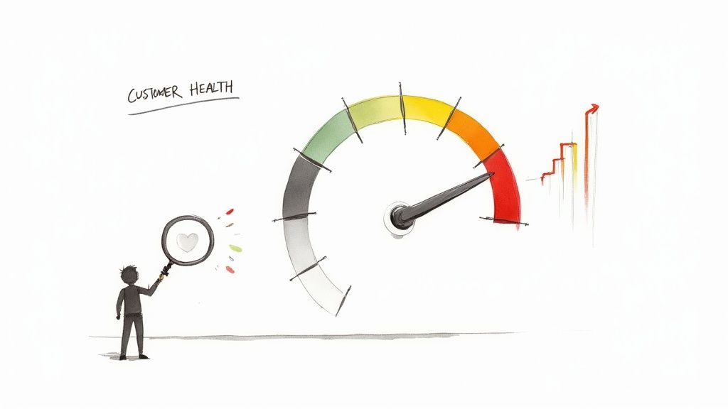
In SaaS, relying on a "gut feeling" about an account's happiness is a recipe for disaster. That big enterprise account that never submits a support ticket? They might not be happy; they might just be disengaged and already demoing your competitors. A Customer Health Score (CHS) cuts through the ambiguity, turning vague feelings into a concrete, actionable number.
Think of it as the mission control dashboard for your entire customer base. It rolls up key behaviors—like how often they log in or which features they use—with sentiment data to give you a single, easy-to-read score. This score isn't just about who's happy right now. It's about predicting who will still be with you in six months.
Why a Simple Score Is So Powerful
I’ve seen a lot of SaaS operators get this wrong by overcomplicating it. They try to build a health score with dozens of different variables, ending up with a model so complex that no one on the customer success team actually trusts it or knows how to use it. The point isn't to build a flawless algorithm; it's to create a reliable early warning system.
A well-designed score gives your team the power to:
- Prioritize outreach: Instead of waiting for a frantic support ticket, your CSMs can focus their energy on accounts showing the first signs of trouble.
- Spot expansion opportunities: A customer with a consistently high health score is practically raising their hand for an upsell or cross-sell conversation.
- Forecast with confidence: When you can reliably gauge account health, you can more accurately predict renewals and potential churn, which is absolutely crucial for stable growth.
- Get everyone on the same page: A shared metric ensures everyone, from CSMs to the C-suite, is speaking the same language about an account's status.
"A simple model that everyone trusts will always outperform a complex one that no one understands. Your health score is useless if your team can't explain it or act on it."
The Proactive Shift in Customer Success
At the end of the day, implementing a CHS is about fundamentally changing your team's mindset from defensive to offensive. You stop just reacting to cancellation emails and start proactively engaging with customers to make sure they're getting every ounce of value from your product. This is what builds real loyalty and turns your customer success team into a revenue-saving machine.
It’s a similar idea to how modern sales teams use data to focus their efforts. If you want to dive deeper into how data can predict outcomes, you might find resources on predictive lead scoring with AI-powered insights interesting.
This guide will walk you through building that exact system, starting with our free customer health score template to download. You'll get the spreadsheet we use ourselves, plus a look at how our AI can surface insights that your standard tools just can't see.
Your Free Template and AI-Powered Insights
Alright, enough with the theory. Let's get our hands dirty and start building a real customer health score. We’ve put together a practical, no-nonsense template to get you from zero to one, fast.
You can grab our free customer health score template right now. This isn't just some generic spreadsheet; it's a framework we built as SaaS operators for other SaaS operators. It's designed from the ground up to be customized for your business.
Getting Started With the Template
Once you open up the template, you’ll see it’s pretty intuitive. We've dropped in some common metrics and categories to give you a head start, but the real magic happens when you make it your own.
Here’s a quick tour of what’s inside:
- Customer Info: The basics—company name, account owner, contract value. This stuff gives you context for every score.
- Metric Categories: We’ve grouped things into logical pillars like Product Usage, Commercial Health, and Customer Sentiment.
- Individual Metrics: In each category, you'll see examples like "Weekly Active Users," "Support Ticket Volume," or "NPS Score."
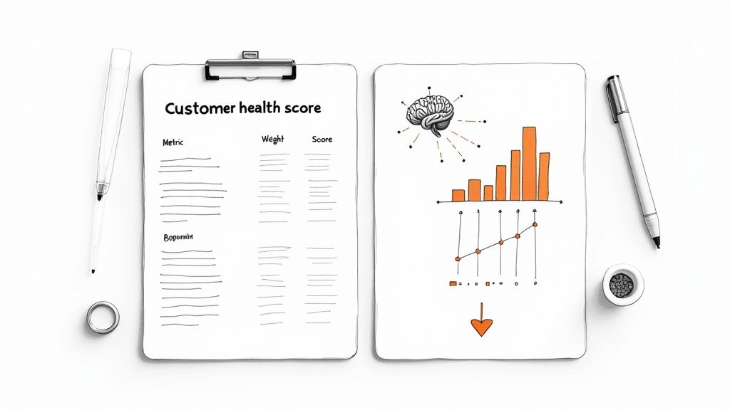
- Weighting Columns: This part is critical. You get to assign a weight to each metric, making sure the most important signals have the biggest impact on the final score.
- Final Health Score: The sheet does the math for you, spitting out a weighted score for each customer so you can see where they stand at a glance.
Your first job is to swap out our placeholder metrics for the ones that actually matter to you. Don't track NPS? Fine, use your CSAT score instead. Is "key feature adoption" a better signal than login frequency? Make the change. The whole point is to build a scorecard that reflects what a "healthy" customer truly looks like in your world. If you love digging into spreadsheets, you can find more great tips on building a solid scorecard format in Excel to take this even further.
The best health score is one that evolves. Don't stress about getting it perfect on day one. Treat this as version 1.0. Plan to revisit and tweak your metrics and weights every quarter based on what the data is telling you.
Beyond the Spreadsheet: AI-Powered Predictive Insights
A spreadsheet is an amazing starting point. Seriously. But it has its limits. It tells you a customer's health score today, but it can't really predict what it will be next month or automatically spot the weird combination of factors that puts an account at risk.
That’s where our AI insights feature comes into play.
After you've filled out the template with your data, you can upload it to our tool. Our system takes your inputs and adds a layer of predictive analysis that a spreadsheet just can’t do. Think of it as having a data scientist on your team, ready to flag problems before they blow up.
Here’s how our tool visualizes your data, giving you clear, actionable insights in seconds.
The dashboard instantly shows you who’s in the "Poor" or "Fair" health buckets, so you know exactly where to focus your attention.
How AI Elevates Your Health Score
Our AI does more than just calculate a score; it looks for the patterns hidden in your data. Here’s what that actually means:
- Finds At-Risk Customers: The AI can flag customers likely to churn in the next 30-60 days, even if their current score looks okay. It might notice a tiny dip in product usage combined with one bad support ticket—a subtle combo a person might easily miss.
- Identifies the "Why": It doesn't just tell you who is at risk, it suggests why. For instance, it might find that customers with low adoption of a specific sticky feature are 80% more likely to churn. Now your CSMs have a concrete talking point for their next call.
- Spots Your Champions: On the flip side, the AI also finds your biggest fans. It can highlight customers with stellar health scores and growing product usage, making them perfect candidates for case studies, testimonials, or an upsell conversation.
Alex Thompson, founder of a B2B project management tool, told us about his experience. "We were using a spreadsheet for health scores, which was way better than nothing. But we were still getting blindsided by churn. After we uploaded our data, the AI instantly flagged three enterprise accounts that looked fine on the surface. Turns out, their engagement in a key reporting feature was slowly dying. We jumped in, did some targeted training, and saved two of them. That was $60k in ARR we would have just lost."
This mix of a flexible free customer health score template to download and a powerful AI analysis engine gives you the best of both worlds. You get the control and simplicity of a spreadsheet with the predictive power of a dedicated data science team. You're no longer just reacting—you're looking around the corner to make smarter decisions that directly grow your business.
Choosing Metrics That Actually Matter for Your SaaS
A customer health score is only as strong as the data you feed it. It’s painfully easy to fall into the trap of tracking vanity metrics—things like daily logins or total time in the app. They might look great on a dashboard, but they don't actually tell you if a customer is going to stick around.
The real goal is to pick metrics that directly tie back to the value a customer is getting from your product. Everything else is just noise.
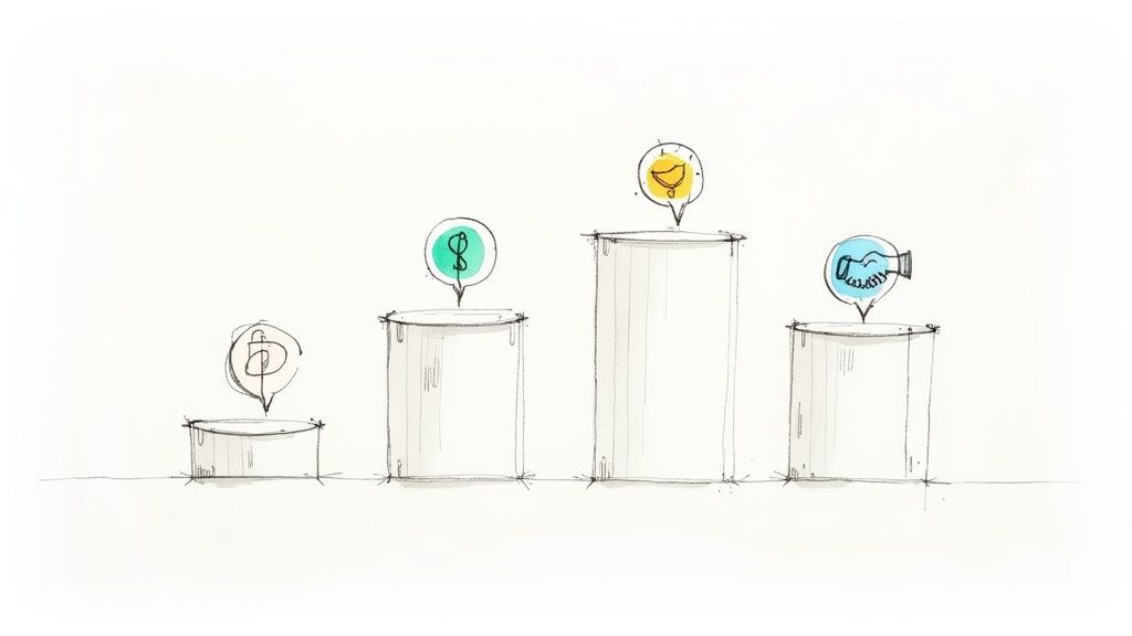
From what I’ve seen, the most successful SaaS companies build their health scores around four core pillars. By grabbing a few key metrics from each, you end up with a balanced, holistic view that covers what customers do, how they feel, and what they pay.
The Four Pillars of a Strong Health Score
Think of these pillars as the legs of a table—if one is wobbly, the whole thing is at risk of collapsing. Our customer health score template (free to download) is built around these exact concepts, making it simple to organize your data and see the full picture.
- Product Usage & Adoption: This is the most obvious one, but also where people mess up the most. It’s not about general activity; it’s about meaningful activity. Are they using the sticky features that you know lead to long-term retention?
- Customer Sentiment & Feedback: This is all about how the customer feels. It’s about taking subjective opinions and feedback and turning them into hard numbers you can track over time.
- Commercial Health: This pillar tracks the money. Are they paying on time? Are they growing? Financial signals are often the last—and loudest—warnings you get before a customer churns.
- Relationship & Service Strength: This is where you quantify the human element. How engaged is the customer with your team? This is where you turn your CSMs’ gut feelings into actual data points.
Let's dig into what you should actually be tracking in each area.
Pillar 1: Product Usage & Adoption Metrics
Stop obsessing over logins. What a customer does after they log in is what counts. Someone who logs in every single day just to export a basic report could be a massive churn risk, while a customer who logs in once a week to use your core workflow automation is probably in a much healthier spot.
Here’s what to focus on instead:
- Key Feature Adoption Rate: Don't try to track every single feature. Identify the 2-3 "sticky" ones that deliver the most value and measure what percentage of a customer's active users have adopted them.
- Depth of Use: Are they just scratching the surface, or are they power users? For a project management tool, this is the difference between someone creating a simple to-do list versus someone building out complex, automated workflows.
- Time to First Value (TTFV): How fast did a new customer get their first "aha!" moment or significant win with your product? A quick TTFV is a fantastic predictor of long-term success.
Pillar 2: Customer Sentiment & Feedback
Usage data tells you what your customers are doing. Sentiment data tells you why. You can have a customer with sky-high product usage who is secretly frustrated and looking for an alternative. Without sentiment data, you'd never know.
Consider tracking these:
- Net Promoter Score (NPS) or CSAT: These are the classics for a reason. But don't just look at the raw score; track the trend. A customer who drops from a 9 to a 7 is a much bigger red flag than a customer who has consistently been a 7.
- Marketing Engagement: Are they actually opening your newsletters, showing up for webinars, or downloading your ebooks? This is a great signal that they’re invested in your brand and ecosystem, not just the tool itself.
- User Feedback Volume: This one feels a bit backward, but are they actively submitting feature requests or bug reports? An engaged—even critical—customer is often far healthier than a silent one. Silence is deadly.
Pillar 3: Commercial Health
This one is pretty straightforward but absolutely critical. A customer can love your product and your team, but if they're constantly paying late or pushing back on every renewal, their health is poor.
Keep an eye on these financial signals:
- Payment History: On-time payments mean a stable, healthy account. Late payments are a massive red flag that can signal cash flow issues or a de-prioritization of your tool.
- Upsell/Cross-sell History: Have they expanded their contract, added new modules, or bought more seats? Account growth is one of the strongest health indicators you can possibly have.
- License Utilization: This is a big one. If they're paying for 100 seats but only 40 are being used, you're going to have a very difficult conversation come renewal time. This metric tells you if they're getting the value they're paying for.
One of the biggest mistakes I see is treating all customers the same. A score of 70 might be fantastic for a self-service SMB account but a five-alarm fire for a high-touch enterprise client. Your thresholds and metric weights must be segmented by customer type.
Pillar 4: Relationship & Service Strength
Finally, this is where you convert your customer success team's invaluable insights into data. No algorithm can ever replace a CSM’s knowledge of an account’s internal politics or know that their main champion just left the company. If you're looking for a deeper dive into the numbers that drive your business, check out our comprehensive guide on the most important SaaS KPIs.
Here's how to quantify that relationship:
- CSM Pulse Score: Have your CSMs assign a subjective score (e.g., 1-10) for the overall relationship health. This is perfect for capturing the nuances and "gut feelings" that quantitative data misses.
- Support Ticket Trends: A high volume of tickets isn't necessarily bad; it can signal deep engagement. The real red flag is a high volume of unresolved or escalated tickets. That points to friction and frustration.
- Executive Business Review (EBR) Cadence: Are key stakeholders consistently showing up for strategic reviews? When they start skipping these meetings, it's often a sign that leadership is disengaging.
Key SaaS Health Score Metrics and Weighting Examples
Here’s a practical look at how you might pull this all together. Remember, the "right" weights depend entirely on your business model, whether you're high-touch enterprise or low-touch PLG.
| Metric Category | Example Metric | Typical Weighting | Best For (SaaS Model) |
|---|---|---|---|
| Product Usage & Adoption | Key Feature Adoption Rate | 25-40% | All models, especially Product-Led Growth (PLG) |
| Product Usage & Adoption | License Utilization | 15-25% | Seat-based models (e.g., project management, CRM) |
| Customer Sentiment | NPS Score/Trend | 10-20% | All models; crucial for high-touch relationships |
| Commercial Health | Upsell/Expansion Revenue | 15-25% | High-touch Enterprise and Mid-Market |
| Commercial Health | On-Time Payment History | 5-10% | All models, especially SMB and self-service |
| Relationship Strength | CSM Pulse Score | 10-20% | High-touch Enterprise (less relevant for PLG) |
| Relationship Strength | Support Ticket Escalations | 5-15% | All models, but especially complex/technical products |
By carefully selecting a few powerful metrics from each of these four pillars, you're well on your way to creating a robust, predictive health score that actually helps you get ahead of churn.
Turning Raw Data Into a Score You Can Actually Use
You’ve got your metrics and the data is flowing in. Great. But a pile of data points isn’t going to tell your CSMs who to call on Monday morning. The real magic happens when you transform that raw data into a single, straightforward health score.
This is where weighted scoring comes into play. It’s all about making sure the most important signals carry the most weight. After all, a customer missing a payment is a much bigger deal than them skipping your last two newsletters, right? Our customer health score template free to download is already set up to do this heavy lifting for you.
The Simple Math Behind a Powerful Score
Let's unpack how this actually works. The whole idea is to get each metric onto a common scale (like 0-100), give it a weight based on its importance, and then tally it all up.
Here’s a quick, real-world example. Say you're looking at a customer with these three data points:
- Key Feature Adoption (40% weight): They're using all the sticky features, so they get a perfect 100/100.
- NPS Score (30% weight): They just gave you an 8 on an NPS survey, which we'll translate to 80/100.
- Support Tickets (30% weight): They've had a rough month with a few escalated tickets, so their score here is a low 20/100.
The calculation is pretty simple:
(100 * 0.40) + (80 * 0.30) + (20 * 0.30) = 40 + 24 + 6 = 70
So, this customer’s health score is 70. It’s a single number that immediately tells a story, balancing their awesome product adoption with some recent service friction. This is exactly why understanding the power of data analytics in driving user insights is so crucial for building a score that genuinely predicts behavior.
What Does a "70" Actually Mean? Defining Your Health Thresholds
Okay, so you have a score. Now what? Is 70 good? Bad? Time to panic? This is where you need to define your health thresholds to put that number into context.
Most teams start with something like this:
- Healthy (Green): 76 – 100
- At-Risk (Yellow): 51 – 75
- Poor (Red): 0 – 50
But please, don't just pull these numbers out of thin air. The best, most accurate thresholds come from digging into your own history.
The most predictive thresholds come from your own historical data. Pull a list of all the customers who churned in the last year and calculate what their health scores were three months before they left. That average score is a powerful starting point for your 'Poor' health threshold.
You can do the same thing for your best customers—the ones who stick around and expand their accounts. Their average score helps you define what "Healthy" truly looks like at your company. This turns your thresholds from a wild guess into a data-backed alert system.
A Quick Process for Historical Analysis
Ready to set your thresholds with confidence? Here's the exact playbook.
- Identify Two Groups: First, make two lists of customers from the last 12 months. One list is for everyone who churned, and the other is for everyone who renewed or expanded their contract.
- Go Back in Time: For every customer on those lists, pull the data for your chosen health metrics from 90 days before they churned or renewed. This is your "crystal ball" moment.
- Calculate Historical Scores: Now, run those historical data points through your weighted model to get a health score for each customer.
- Find the Averages: Calculate the average score for your "churned" group and the average score for your "renewed/expanded" group.
- Set Your Thresholds: Use these averages to guide you. The average score of your churned customers is a fantastic starting point for the line between Poor and At-Risk. The average for your happy, expanding customers helps you set the bar for Healthy.
Following this process ensures your scoring system is customized to your business and your customers. These thresholds are just as important as the score itself because they’re what trigger action from your team—a vital part of any effective business scorecards and dashboards.
Putting Your Customer Health Score to Work
A customer health score sitting in a spreadsheet is like a smoke detector with no batteries—it looks the part, but it’s not going to save you when a fire starts. The whole point of this exercise is to trigger specific, repeatable actions that cut down on churn and open up expansion opportunities. This is where your data turns into real-world results.
The best Customer Success Managers (CSMs) don't just stare at dashboards. They have a Standard Operating Procedure (SOP) baked and ready for every health segment. When a score changes, there’s no guesswork. The team knows exactly which playbook to run.
Building Your Action-Oriented Playbooks
Your playbooks need to be simple, direct, and tied directly to the health score thresholds you’ve already defined. Just ask yourself: what's the single most valuable thing my team can do for a customer who is 'Poor', 'At-Risk', or 'Healthy'?
The immediate goal is to move every customer up the ladder—from Poor to At-Risk, and from At-Risk to Healthy. For your green accounts, the game changes to retention, advocacy, and expansion.
This is the basic flow that gets your scores ready for action.
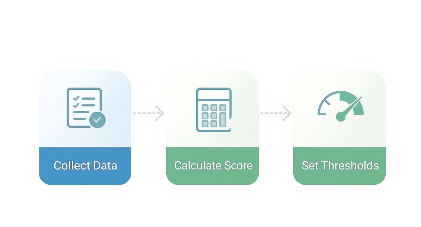
This simple loop—collecting the right data, calculating a weighted score, and setting clear thresholds—is the engine that powers your operational playbooks.
Playbook Example for 'At-Risk' Customers
When an account’s score slips into the 'At-Risk' (yellow) zone, you have to move fast. It’s not a five-alarm fire just yet, but the smoke is there. Your playbook should be designed to quickly figure out what’s wrong and show the customer you're on their side.
Here’s what an effective 'At-Risk' playbook might look like, mixing automation with a human touch:
- Instant Internal Alert: A Slack notification automatically pings the assigned CSM and the account owner. The message should have the customer's name, their new score, and which specific metric caused the drop.
- Automated Email Nudge: Kick off a pre-written, 3-part email sequence. The first one could offer a helpful resource tied to the metric that dropped, like a guide to a feature they aren't using.
- The Personal Touch: The CSM has to make a personal call or send a quick video message within 48 hours. The goal isn't to ask, "Hey, are you going to churn?" It's to offer genuine help: "I noticed you haven't had a chance to use our reporting feature yet. I have a few ideas on how it could save your team time. Got 15 minutes to connect this week?"
- Targeted Training: If the problem is low adoption, offer a private, 30-minute training session for their team, focusing on their specific needs.
This multi-touch approach uses automation for speed and personal outreach for real impact. It proves you're proactively looking out for them, not just waiting for them to complain.
Playbook Example for 'Healthy' Customers
Don't ignore your healthy customers! These accounts represent your biggest growth opportunities. The playbook for 'Healthy' (green) customers is all about nurturing that great relationship and finding the perfect moment to ask for more.
A simple 'Healthy' playbook could include:
- Find Your Champions: Proactively reach out to the most active users in the account. Gather their feedback and turn them into internal champions who will fight for your product.
- Ask for a Case Study: When a customer's score has been consistently high for over 90 days, it’s the ideal time to ask them to share their success story.
- Run a Strategic Business Review: Schedule a quarterly business review (QBR) to show them the ROI they've already achieved and introduce new features that align with their goals. This is your prime time to talk expansion.
These actions do more than just solidify the relationship; they turn your happiest customers into a powerful engine for your marketing and sales teams. Building out these kinds of workflows is a key part of creating a customer success playbook that actually scales as you grow.
"We were drowning in data but starving for insight. Once we linked health scores to specific playbooks, everything changed. Our CSMs finally had a clear plan. We cut our churn by 15% in just two quarters because we started having the right conversations with the right customers at the right time."
— Sarah Jennings, VP of Customer Success at a B2B SaaS company
Remember, the free customer health score template from SaaS Operations is your starting point. You can get even more out of it by feeding your data into our tool, which provides AI insights to help you spot trends and refine these playbooks even further. A score is just a number until you pair it with a clear, actionable plan.
A Few Common Questions About Customer Health Scores
Even with a great template and a solid game plan, you're bound to have questions as you start putting a health scoring system into practice. Let's walk through some of the most common ones I hear from other SaaS operators so you can get started with confidence.
How Often Should I Be Updating These Scores?
For most SaaS companies, updating your scores weekly is the sweet spot. It's often enough to spot a worrying trend before it turns into a real problem, but not so often that you're just reacting to daily noise.
That said, your business model really dictates the right rhythm.
- High-Touch Enterprise Accounts: Sticking to a weekly or even bi-weekly update usually makes sense here. Changes in these massive, complex accounts tend to happen more slowly.
- High-Velocity or SMB Customers: If you're running a product-led model or have shorter contracts, you might want to look at daily updates. A sudden usage drop from a smaller account can be an immediate churn risk, and you need to see that now.
The main thing is to be consistent. Pick a schedule and stick with it. This helps your team build a reliable habit of checking the scores and taking action.
Do I Need to Be a Tech Whiz to Use This Template?
Not at all. We specifically designed our free customer health score template to work in a regular spreadsheet. If you know how to type numbers into a cell, you're good to go. All the formulas that handle the weighting and calculate the final score are already baked in for you.
And when you're ready to get more sophisticated, our platform at SaaS Operations is just as user-friendly. You can upload the template you've been using, and our tool takes over from there, giving you AI-powered insights without you ever needing to touch a line of code. It's built for operators, not data scientists.
The biggest mistake I see teams make is waiting for the "perfect" model. Don't let perfection be the enemy of good. Start simple with a few metrics you can actually track. A basic score your team trusts and uses is a thousand times better than some complex model nobody understands.
What's the Biggest Mistake I Can Make Setting This Up?
Hands down, the single biggest pitfall is trying to track too many metrics, especially vanity metrics that don't mean anything. It's so tempting to want to include every piece of data you have, but that almost always creates a score that's confusing and impossible to act on.
Instead, start small. Focus on just 5-8 core metrics that are clearly tied to a customer getting real value from your product. A simple, understandable score is a powerful tool for your CS team. You can always add more layers later on once you've proven the core model actually works.
At SaaS Operations, we're all about giving you battle-tested playbooks, templates, and SOPs to help you run a more effective business. Get a head start by downloading our free customer health score template and see for yourself how simple, actionable data can change the game.