In the world of SaaS, data is everywhere. But raw data doesn’t drive growth; actionable insights do. The challenge isn’t collecting metrics, it’s presenting them in a way that fuels smart, fast decisions. A well-designed metrics dashboard transforms overwhelming numbers into a clear story, highlighting what’s working, what isn’t, and where your next big opportunity lies. Without one, you’re navigating your business blindfolded.
This article cuts through the noise to show you exactly how leading platforms visualize success. We’ve compiled a list of powerful metrics dashboard examples from real-world tools like Geckoboard, Looker Studio, and DashThis. Each example is more than just a picture; it’s a strategic breakdown. We’ll analyze the key performance indicators (KPIs) they track, the logic behind their layouts, and the actionable takeaways you can apply to your own dashboards today.
Forget generic templates. You’ll get a behind-the-scenes look at specific dashboards for marketing, sales, engineering, and executive teams. We provide screenshots, direct links, and a deep dive into the “why” behind each design. By the end, you’ll have a playbook of replicable strategies to build a dashboard that doesn’t just report numbers but actively powers your growth engine.
1. Etsy
While not a traditional dashboard software, Etsy has carved out a unique niche as a go-to marketplace for pre-designed, customizable metrics dashboard templates. It’s an unexpected but powerful resource for SaaS operators, especially those in early stages or those looking for highly visual, cost-effective solutions without the commitment of a complex BI tool.
The platform stands out by offering instant access to a vast array of creative and unique designs from independent creators worldwide. You can find templates built for specific tools like Google Sheets, Excel, Notion, and even Canva, making it easy to find a solution that fits your existing workflow.
Strategic Analysis & Key Insights
Etsy’s value lies in its combination of affordability, speed, and customization. Unlike dedicated SaaS platforms that require subscriptions and setup time, Etsy provides an immediate asset. You can purchase, download, and start populating a professionally designed dashboard in minutes.
- KPI Focus: Templates often cater to specific business needs, such as tracking Monthly Recurring Revenue (MRR), Customer Churn Rate, and Lead Conversion Rates. Many sellers specialize in dashboards for marketing campaigns, social media analytics, or financial performance.
- Layout & Design: This is where Etsy truly shines. You can find minimalist, data-heavy, or highly visual infographic-style dashboards. This variety allows you to choose a layout that best communicates your key data to your specific audience, whether it’s for an internal team meeting or a board presentation.
Key Takeaway: Etsy is the ideal starting point for teams that need a visually compelling dashboard quickly and on a budget. The ability to find niche templates, like a scorecard for a new customer onboarding process, makes it a surprisingly strategic tool. It’s a great example of how effective metrics dashboards don’t always require expensive software.
Actionable Takeaways & Best Practices
To get the most out of Etsy, filter your search by software compatibility (e.g., “Google Sheets metrics dashboard”). Always read the reviews and check the seller’s ratings to ensure quality and support. Many sellers also offer customization services for a small additional fee. For SaaS companies focusing on client-facing reports, these templates can provide a strong foundation for building out a repeatable process, much like developing a solid customer success strategy. You can explore a comprehensive guide to building effective client strategies by reviewing this customer success playbook.
- Website: Etsy Metrics Dashboard Marketplace
- Pricing: One-time purchase, typically ranging from $5 to $50.
- Best For: Startups, small teams, and anyone needing a quick, visually appealing, and budget-friendly dashboard solution.
2. Geckoboard
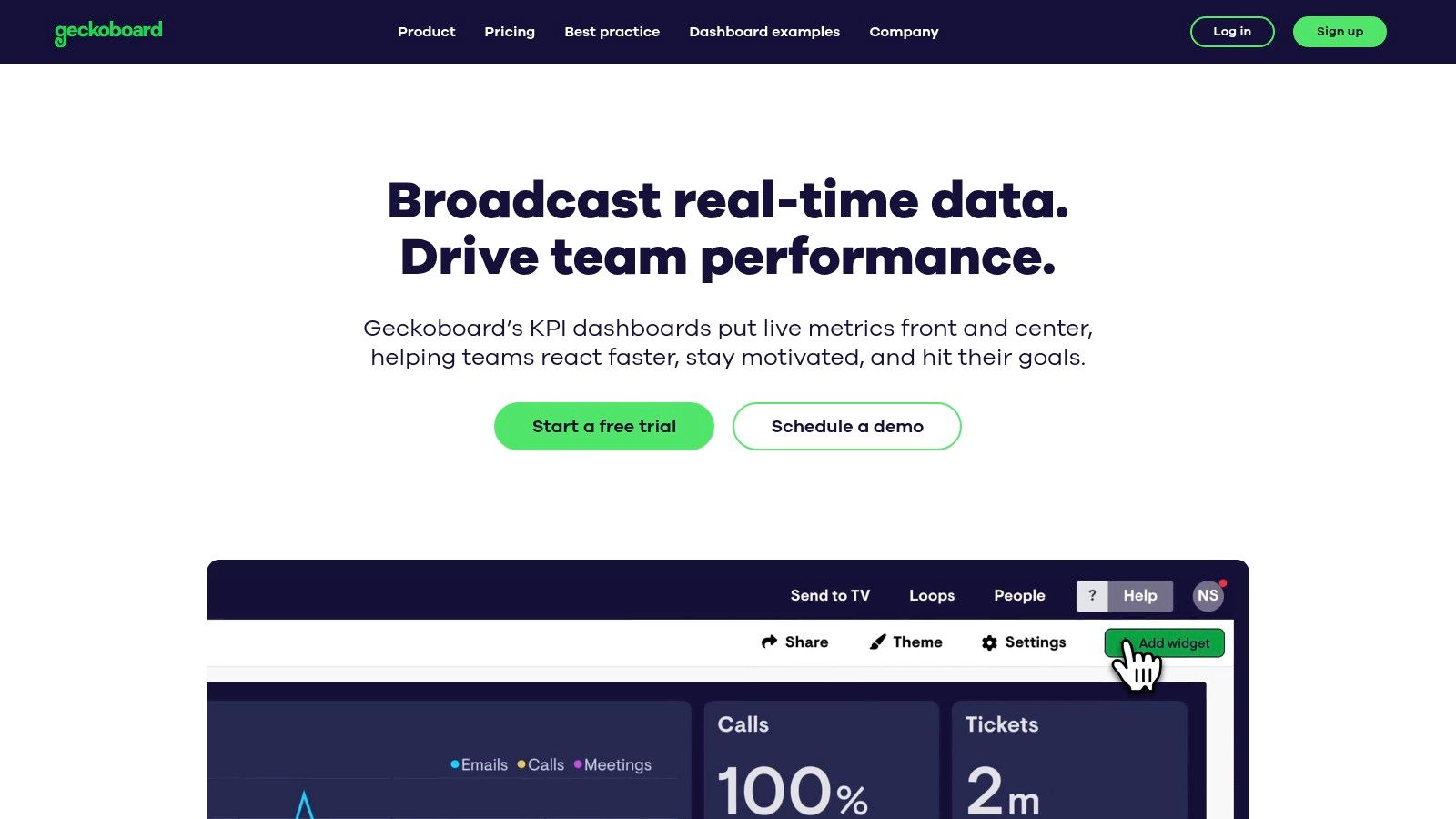
Geckoboard is a powerful, yet user-friendly platform designed to help teams build and share live metrics dashboards. It excels at pulling real-time data from various sources and presenting it in a clean, easily digestible format, making it a favorite among SaaS companies aiming to foster a data-driven culture across the organization.
The platform distinguishes itself with its focus on simplicity and team-wide visibility. With over 90 pre-built integrations, Geckoboard allows non-technical users to connect to tools like Salesforce, Google Analytics, and Zendesk and create a dashboard in minutes. Its interface is optimized for display on large TV screens in an office setting, ensuring key metrics are always front and center for everyone.
Strategic Analysis & Key Insights
Geckoboard’s strategic advantage is its commitment to “status at a glance.” It avoids the complexity of deep-dive BI tools, instead providing an immediate, real-time snapshot of business health. This makes it an excellent tool for operational teams that need to react quickly to changing conditions.
- KPI Focus: The platform is ideal for tracking high-level, real-time operational metrics. Common examples include Active Support Tickets, New Sign-ups Today, Server Uptime, and Website Live Visitors. This focus on immediate data helps teams monitor performance against daily or weekly goals.
- Layout & Design: Geckoboard’s drag-and-drop builder prioritizes clarity over complexity. The layouts are clean and grid-based, using visualizations like gauges, leaderboards, and number widgets to make data pop. This design philosophy ensures that the dashboards are understandable in seconds, which is crucial for a TV display.
Key Takeaway: Geckoboard is the go-to solution for making data visible and accessible to your entire team. It’s not for complex data exploration but for broadcasting the most important metrics that drive daily decisions. It is one of the best metrics dashboard examples for fostering transparency and accountability.
Actionable Takeaways & Best Practices
To maximize Geckoboard’s impact, focus each dashboard on a specific team or goal, like a support team dashboard or a marketing campaign monitor. Use the “Sharing Link” feature to give stakeholders access without requiring a login. It’s also wise to start with their pre-built templates to understand how best to visualize your data before creating custom dashboards from scratch. Choosing the right metrics is critical; you can discover essential metrics by reviewing this guide to SaaS KPIs.
- Website: Geckoboard
- Pricing: Plans start at $49/month, with more advanced features and integrations available in higher-tier plans.
- Best For: Small to medium-sized SaaS businesses, support teams, and marketing departments needing real-time visibility of key operational metrics.
3. DashThis
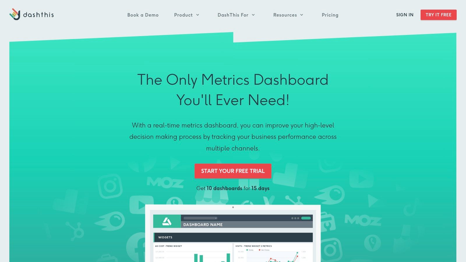
DashThis is a powerful reporting tool designed specifically for digital marketers and agencies, making it one of the best metrics dashboard examples for SaaS marketing teams. It excels at consolidating data from numerous marketing channels into a single, clean, and customizable interface. This focus on marketing automation simplifies the often-complex task of tracking campaign performance across platforms.
The platform distinguishes itself through its user-friendly, drag-and-drop report builder and a library of pre-built templates. These features allow teams to quickly generate professional-looking dashboards for SEO, PPC, social media, and email marketing without needing extensive technical skills, freeing up valuable time to focus on strategy instead of manual data entry.
Strategic Analysis & Key Insights
DashThis provides strategic value by automating the entire marketing reporting workflow. Its strength lies in its 50+ native integrations, including essentials like Google Analytics, Google Ads, and Facebook Ads. This allows SaaS marketers to pull key metrics directly into their dashboards, ensuring data accuracy and saving countless hours.
- KPI Focus: DashThis is optimized for marketing KPIs such as Cost Per Acquisition (CPA), Click-Through Rate (CTR), Conversion Rate, and Return on Ad Spend (ROAS). Its widgets are designed to visualize these metrics effectively, making performance trends easy to spot.
- Layout & Design: The platform offers clean, professional layouts that are easy to read and share. While less customizable than a BI tool, its templates are designed with clarity in mind, which is perfect for client reporting or internal stakeholder updates where straightforward communication is paramount.
Key Takeaway: DashThis is the go-to solution for marketing teams who need to automate their reporting and produce consistent, professional-looking dashboards. It removes the friction of data collection, allowing operators to spend more time analyzing performance and less time building reports from scratch.
Actionable Takeaways & Best Practices
To maximize DashThis, start with their pre-built templates for your most used channels (e.g., “Google Analytics Report”) and then customize them by adding your specific KPIs. Use the automated email dispatch feature to schedule weekly or monthly reports for stakeholders, ensuring everyone stays informed. This level of automation is crucial for streamlining processes like a monthly business review. To help structure these meetings, you can use this monthly business review template.
- Website: DashThis Marketing Dashboards
- Pricing: Plans start at $45/month, scaling based on the number of dashboards.
- Best For: Marketing agencies, in-house marketing teams, and SaaS companies focused on tracking digital campaign performance.
4. Metabase
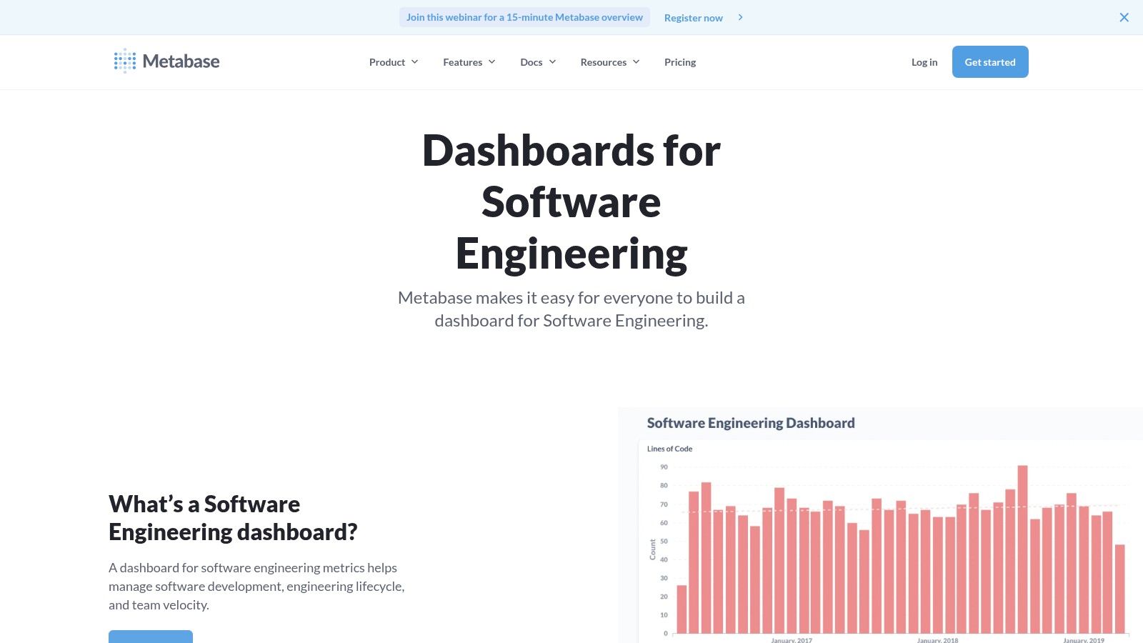
Metabase has established itself as a leading open-source business intelligence tool, offering a powerful and accessible way for companies to explore and visualize their data. It’s designed for users of all technical abilities, allowing non-analysts to ask questions and build dashboards without writing a single line of SQL.
This user-friendly approach makes it an excellent choice for SaaS companies looking to democratize data access across teams. By connecting directly to a wide range of databases, Metabase empowers departments like marketing, sales, and customer success to self-serve their data needs, reducing the bottleneck on engineering resources.
Strategic Analysis & Key Insights
Metabase’s core strength is its simplicity and speed of deployment. While more complex BI tools can take weeks to configure, Metabase can be up and running in minutes, providing immediate value and fostering a data-driven culture from day one.
- KPI Focus: Metabase is versatile enough to track a wide array of SaaS metrics. Engineering teams can monitor Deployment Frequency and Cycle Time, while a marketing team could build a metrics dashboard example to track Customer Acquisition Cost (CAC) and Lead Velocity Rate. Its interactive filters allow users to drill down into the data, for instance, segmenting Net Revenue Churn by customer plan.
- Layout & Design: Dashboards in Metabase are clean, functional, and highly interactive. Users can combine different charts, tables, and text cards to create a comprehensive overview. The ability to add filters that apply to multiple charts on a dashboard makes it a powerful tool for exploratory analysis during team meetings.
Key Takeaway: Metabase is the ideal BI tool for SaaS companies that want to empower non-technical teams with data without a significant financial investment. Its open-source nature means it’s not just a product but a platform with a strong community, offering a great balance between ease-of-use and powerful features.
Actionable Takeaways & Best Practices
To maximize Metabase, start by connecting it to a read-only replica of your production database to ensure performance and security. Use the “Ask a question” feature to let team members explore data naturally before saving the most valuable queries as charts for a shared dashboard. This encourages a culture of curiosity and data exploration. For SaaS operators, this mirrors the principle of providing clear tools for success, similar to how a well-structured customer success playbook guides a team toward repeatable wins.
- Website: Metabase Software Engineering Dashboard Example
- Pricing: Free and open-source (self-hosted). Paid cloud plans are also available.
- Best For: Teams of all sizes seeking a free or cost-effective, user-friendly BI tool with quick setup and a strong community.
5. Whatagraph
Whatagraph is a marketing data platform built specifically for agencies and in-house marketing teams that need to report on cross-channel performance. It excels at aggregating data from over 45 popular marketing sources, automating the reporting process, and turning complex datasets into clean, shareable dashboards.
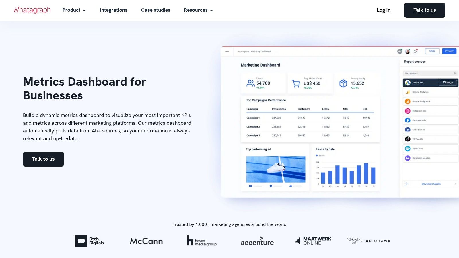
The platform is designed to eliminate the manual work of logging into multiple platforms, exporting data, and pasting it into spreadsheets. Instead, it provides a centralized hub where metrics from tools like Google Analytics, Facebook Ads, and SEMrush are automatically pulled into pre-built or custom visual reports.
Strategic Analysis & Key Insights
Whatagraph’s core strength is its focus on automation and presentation for marketing-specific KPIs. It’s not a general-purpose BI tool but a specialized solution that understands the language and needs of marketers, making it one of the most practical metrics dashboard examples for this function.
- KPI Focus: The platform is optimized for tracking key marketing metrics like Cost Per Acquisition (CPA), Return on Ad Spend (ROAS), Click-Through Rate (CTR), and Conversion Rate. Its widgets are pre-configured to display these KPIs, saving significant setup time.
- Layout & Design: Whatagraph prioritizes clarity and a professional aesthetic. Dashboards are built using a drag-and-drop editor with clean widgets and graphs. This makes it easy to create reports that are immediately understandable for clients or executives who may not be data experts.
Key Takeaway: Whatagraph is the go-to solution for SaaS marketing teams drowning in data from multiple channels. Its ability to automate reporting and create visually appealing, cross-channel dashboards makes it an invaluable tool for demonstrating marketing ROI and streamlining client communication.
Actionable Takeaways & Best Practices
To maximize Whatagraph, connect all your core marketing data sources during setup to build a single source of truth. Use the automated report-sending feature to schedule weekly or monthly performance updates for key stakeholders. For SaaS companies looking to improve their initial user experience, applying the same principles of clear, automated communication is key; you can see how this works by studying these SaaS onboarding best practices.
- Website: Whatagraph Metrics Dashboard
- Pricing: Plans start at $223 per month (billed annually) for the Professional plan, with custom pricing for larger teams and agencies.
- Best For: Marketing agencies and in-house SaaS marketing teams managing multi-channel campaigns and needing automated, client-ready reports.
6. Axify
Axify is a purpose-built engineering intelligence platform designed to give software development leaders clear visibility into their team’s performance and processes. Unlike general-purpose BI tools, it offers a specialized metrics dashboard example focused exclusively on the software development lifecycle, translating complex engineering activities into understandable business outcomes.
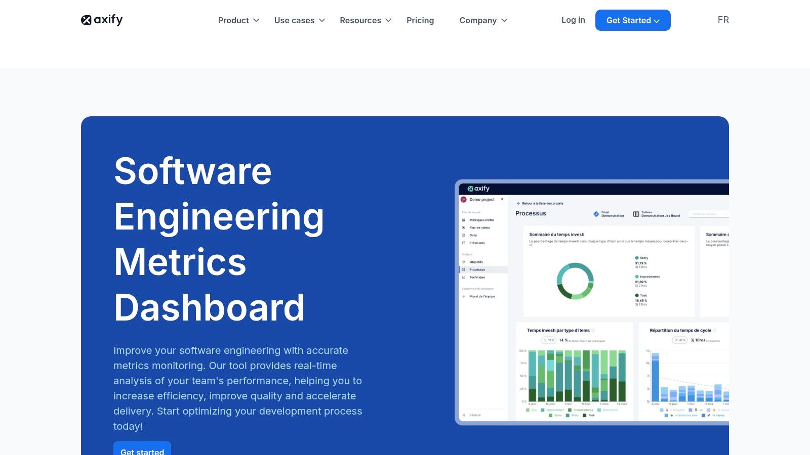
The platform stands out by connecting directly to the tools engineers already use, like GitHub and Jira. It automatically gathers data and presents it through intuitive dashboards that highlight efficiency, quality, and productivity, removing the need for manual data collection and spreadsheet management. This direct integration provides real-time insights and historical trends, helping teams identify bottlenecks and celebrate wins.
Strategic Analysis & Key Insights
Axify’s strength is its laser focus on engineering metrics that matter for SaaS operations. It moves beyond simple activity tracking to provide context around team health and project velocity, making it a powerful tool for VPs of Engineering and CTOs aiming to optimize their development engine.
- KPI Focus: The dashboards are centered on critical DORA metrics such as Deployment Frequency, Lead Time for Changes, and Change Failure Rate. It also tracks Cycle Time and Code Rework Rate, giving a holistic view of both speed and quality.
- Layout & Design: Axify’s interface is clean and goal-oriented. It uses clear visualizations like trend lines and bar charts to make complex data digestible. Informative tooltips and built-in recommendations guide users toward actionable improvements, transforming the dashboard from a reporting tool into a coaching mechanism.
Key Takeaway: Axify provides a pre-configured, best-practice framework for measuring engineering performance. It’s an ideal example of a metrics dashboard that aligns development efforts with business goals, helping SaaS companies ship better products faster and more reliably.
Actionable Takeaways & Best Practices
To maximize Axify’s value, start by integrating it with your primary source code repository and project management tools. Use its historical trend analysis to establish a baseline for your team’s performance before setting improvement goals. The platform’s insights are most powerful when used to facilitate collaborative discussions during team retrospectives, not as a tool for individual performance management. This approach fosters a culture of continuous improvement, which is a core pillar of a successful product development process.
- Website: Axify Software Engineering Metrics Dashboard
- Pricing: Custom pricing based on the number of developers; a free trial is available.
- Best For: SaaS companies, engineering leaders, and development teams that need to measure and improve their software delivery performance with actionable data.
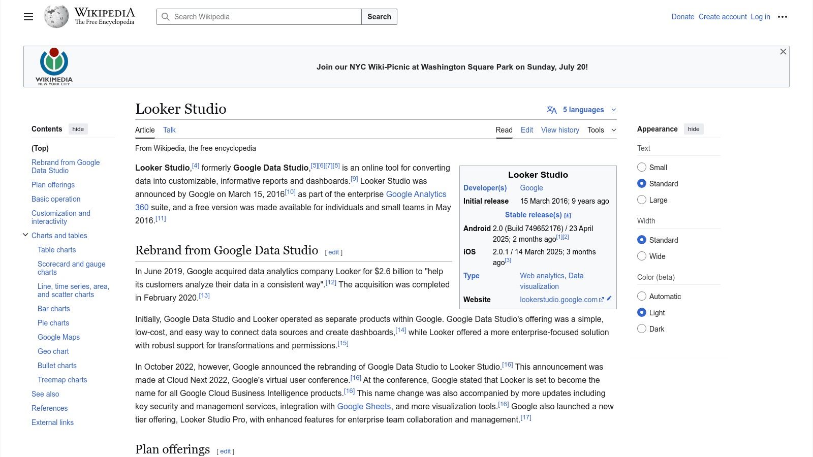
7. Looker Studio
Looker Studio, formerly known as Google Data Studio, is a powerhouse free tool that transforms raw data into fully interactive, shareable metrics dashboards. As part of the Google ecosystem, it offers unparalleled native integration with services like Google Analytics, Google Ads, and BigQuery, making it an essential tool for SaaS companies deeply embedded in Google’s advertising and analytics platforms.
The platform empowers users to pull data from hundreds of sources, not just Google products, and visualize it using a drag-and-drop interface. This flexibility allows SaaS operators to blend marketing spend data with product usage metrics and financial performance all in one view.
Strategic Analysis & Key Insights
Looker Studio’s primary strategic advantage is its accessibility and zero cost, which democratizes data visualization for teams of all sizes. It removes the budget barrier that often prevents early-stage SaaS companies from adopting a dedicated BI tool, providing robust functionality for free.
- KPI Focus: Its direct connectors make it ideal for tracking marketing and sales funnel metrics. SaaS teams heavily rely on it to monitor Cost Per Acquisition (CPA), Ad Spend ROI, Website Conversion Rates, and user behavior flows from Google Analytics. You can also connect it to Google Sheets to track operational KPIs like MRR and Churn.
- Layout & Design: While not as stylistically diverse as paid tools, Looker Studio offers significant control over layout. Users can create multi-page reports, add interactive filters, and embed dashboards into other platforms like Notion or internal wikis. The focus is on clarity and function over artistic flair, which is perfect for internal performance monitoring.
Key Takeaway: Looker Studio is the go-to choice for SaaS teams needing a powerful, no-cost BI tool that integrates seamlessly with their existing data stack, especially Google services. It excels at creating live, data-driven dashboards that are perfect for weekly performance reviews and campaign monitoring.
Actionable Takeaways & Best Practices
To maximize Looker Studio, start with a template from the community gallery to understand the architecture before building from scratch. Use data blending to combine information from different sources, for instance, merging Google Ads cost data with your CRM’s conversion data to get a true ROI picture. For standardized reporting, creating a consistent layout can be very effective, a concept you can explore further with a guide on scorecard formats. Be mindful that performance can slow with very large or complex datasets, so pre-aggregating data in your source (like BigQuery or a Google Sheet) is a best practice.
- Website: Looker Studio
- Pricing: Free.
- Best For: SaaS companies of all sizes, especially those heavily using the Google ecosystem for marketing and analytics.
Key Features Comparison of 7 Dashboard Tools
| Platform | Implementation Complexity 🔄 | Resource Requirements ⚡ | Expected Outcomes 📊 | Ideal Use Cases 💡 | Key Advantages ⭐ |
|---|---|---|---|---|---|
| Etsy | Low – Instant download, no setup needed | Minimal – One-time purchase | Unique, creative dashboards with varying quality | Users needing affordable, unique templates | Affordable pricing, unique designs |
| Geckoboard | Moderate – Setup data integrations | Medium – Subscription cost | Real-time KPI visibility across devices | Small-medium businesses seeking real-time data | Intuitive UI, extensive integrations |
| DashThis | Moderate – Setup integrations and templates | Medium-High – Subscription | Automated marketing reports with some customization | Digital marketers/agencies | Time-saving automation, responsive support |
| Metabase | Moderate – Database connection/setup | Low – Free, open-source | Customizable dashboards without coding | Organizations needing cost-effective BI tool | Free, quick deployment, no SQL needed |
| Whatagraph | Moderate – Data source integration setup | Medium-High – Subscription | Simplified marketing visuals and automated reporting | Agencies and in-house marketing teams | Simplifies complex data, automated reports |
| Axify | High – Integration with dev tools required | Medium – Subscription | Engineering productivity and quality insights | Software development teams | Tailored for developers, actionable insights |
| Looker Studio | Moderate – Connect and customize reports | Low – Free | Interactive, collaborative dashboards with Google integration | Users in Google ecosystem needing interactive reports | Free, real-time updates, collaboration |
From Examples to Execution: Build Your Actionable Dashboard
We’ve journeyed through a powerful lineup of metrics dashboard examples, from the visual storytelling of Whatagraph to the engineering-focused precision of Axify and the customizability of Looker Studio. Each example offers more than just a pretty picture; they represent a strategic approach to data, designed to answer critical business questions and drive specific actions. The common thread is clear: the most effective dashboards are not merely data repositories. They are purpose-built command centers tailored to a specific audience and objective.
Whether tracking marketing campaign ROI like the DashThis examples or monitoring core SaaS KPIs with Geckoboard, the goal is always to move from data to decision. A well-designed dashboard transforms raw numbers into a narrative, revealing trends, highlighting anomalies, and empowering your team to act with confidence. It’s about creating a single source of truth that aligns everyone, from the marketing team analyzing lead sources to the CEO monitoring Monthly Recurring Revenue (MRR).
Key Takeaways for Building Your Dashboard
As you move from inspiration to implementation, remember these core principles distilled from the examples we analyzed:
- Define the “Why” First: Before you drag and drop a single widget, clearly define the dashboard’s purpose. Who is it for, and what specific questions must it answer? A sales dashboard has different needs than a developer-focused one.
- Context is King: Numbers without context are meaningless. Use comparisons, trend lines, and clear labels to show what the data actually means. Is a 10% churn rate good or bad? Your dashboard should provide the benchmarks to answer that.
- Prioritize Visual Hierarchy: The most important metric should grab the most attention. Use size, color, and placement to guide the user’s eye directly to the KPIs that matter most, just as Etsy prioritizes its top-line sales figures.
- Less is More: Avoid the temptation to cram every possible metric onto one screen. A cluttered dashboard creates confusion, not clarity. Focus on the essential, actionable metrics that align with your primary objective.
Choosing Your Tool and Taking Action
Selecting the right tool is a crucial next step. Your choice depends on your team’s technical skill, your budget, and the complexity of your data sources.
- For simplicity and speed: Tools like Geckoboard and DashThis offer intuitive interfaces and pre-built integrations, allowing you to get up and running quickly.
- For deep customization and complex data: Platforms like Looker Studio and Metabase provide the flexibility to build highly specific, tailored reports, but may require more technical setup.
- For niche needs: Specialized tools like Axify deliver hyper-focused metrics for specific departments, such as engineering teams.
Ultimately, the best metrics dashboard examples serve as a blueprint. Your task is to take these strategic insights and apply them to your unique business context. Start small, focus on a single business area, gather feedback from the end-users, and iterate. Your dashboard is a living tool that should evolve alongside your business. The journey from scattered data points to a clear, actionable strategy begins with that first, well-designed dashboard.
Building an effective dashboard is just one piece of the puzzle. To truly excel, you need to connect your data to streamlined workflows and optimized processes. SaaS Operations helps you build the operational foundation to turn your dashboard insights into real-world results. Discover how to create scalable systems that make your data actionable at SaaS Operations.