Tired of watching customers slip through your fingers without knowing why? We’ve all been there. You see the churn number, and your stomach drops, but the metric itself doesn't tell you the whole story. It's like a doctor seeing a fever but not knowing the cause.
A churn diagnosis tool isn't just about tracking a number. It's about getting to the why—pinpointing the exact friction points in your product, onboarding, or even billing that are pushing people away. It’s the difference between seeing a statistic and understanding the story behind it. This is how you move from guessing to making precise, data-driven decisions that actually improve retention.
Stop Guessing and Start Diagnosing Churn
Let's be honest, just tracking churn is a reactive game. It’s like trying to fill a leaky bucket by just pouring more water in—it’s exhausting, expensive, and you’re never really fixing the problem. The real win comes when you find the holes and patch them up for good.
This is where a systematic churn diagnosis process becomes your secret weapon. It’s all about shifting from high-level metrics to the nitty-gritty reality of what your users are actually experiencing. To really get a handle on this, it's worth understanding the fundamentals of churn first. For a solid primer, check out this a comprehensive guide to understanding churn in SaaS.
The Foundation of a Strong Diagnosis
Before you can fix anything, you have to get your data straight. A single, blended churn rate is a vanity metric that hides the real problems. You have to break it down.
The first and most critical cut is separating the two main types of churn:
- Voluntary Churn: This is when a customer makes a conscious decision to cancel. It’s a direct signal that something is off with your product’s value, the user experience, or your support.
- Involuntary Churn: This happens when customers leave for reasons beyond their control, like a failed payment or an expired credit card. It’s almost always a sign that your billing and dunning process needs work.
Just making this one distinction immediately tells you where to focus: do you have a product problem or a process problem? From there, you can dig even deeper with customer cohorts—grouping users by shared traits like their sign-up date or pricing plan. This isn't optional; it's the bedrock of any real analysis.
"A proper churn diagnosis isn't about finding a single 'magic bullet' to fix retention. It's about building a repeatable system to continuously identify and address the small frictions that, over time, cause your best customers to leave."
Key Churn Metrics to Start Your Diagnosis
To get started, you need to be tracking the right things. This table breaks down the essential metrics that will form the foundation of your churn diagnosis. Think of it as your initial dashboard for understanding customer behavior.
| Metric | What It Measures | Why It Matters for Diagnosis |
|---|---|---|
| Customer Churn Rate | The percentage of customers who cancel their subscription over a specific period. | This is your top-level health indicator. A rising rate is your first red flag. |
| Revenue Churn Rate | The percentage of monthly recurring revenue (MRR) lost from existing customers. | Shows the financial impact of churn. High revenue churn from a few big accounts is a different problem than low revenue churn from many small ones. |
| Voluntary vs. Involuntary Churn | Differentiates between customers who choose to leave and those who churn due to payment failures. | This is your first diagnostic split. It tells you whether to investigate product value or billing processes. |
| Cohort Churn Rate | Churn rate segmented by user groups (e.g., by sign-up month, plan type, or acquisition channel). | This is where the real insights are. It helps you spot patterns, like if users from a certain marketing campaign churn faster than others. |
These metrics are your starting point. By tracking them consistently, you'll begin to see the patterns that lead to real, actionable insights.
From Data to Actionable Insights
Getting this detailed isn’t just an academic exercise—it has a massive financial upside. Research has shown that reducing customer churn by just 5% can boost profits anywhere from 25% to 95%. That's a huge return, and it’s why smart operators build a solid churn diagnosis process.
The infographic below shows how this all flows together. You start by grouping users into cohorts, segmenting them to get a clear picture, and then digging in to diagnose the root cause.
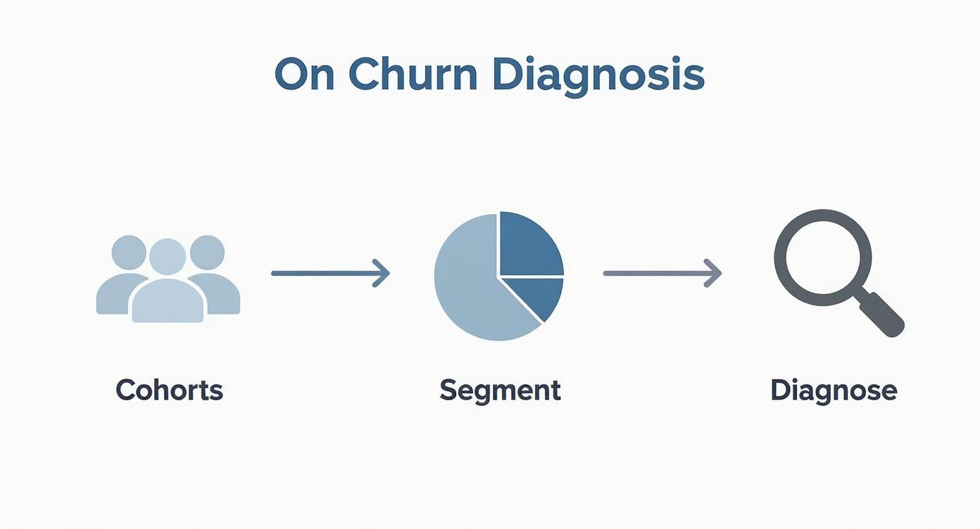
This entire process is about turning a vague, scary problem like "high churn" into a specific, solvable one, like "new users on our Pro plan churn in month two because they aren't adopting Feature X during onboarding." Now that's something you can fix. By laying this groundwork, you’re not just chasing a metric. You're building a system to turn your data into real-world retention strategies.
Unifying Your Data for a Clearer Picture
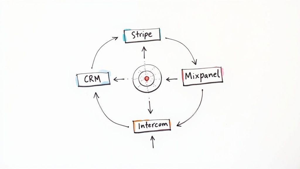
Let's be honest, diagnosing churn is next to impossible when your customer data is a complete mess. The real problem for most SaaS operators isn't a lack of data—it’s that the data is scattered across a dozen different tools.
Your billing history is in Stripe, customer chats are buried in Intercom, product usage trends are in Mixpanel, and all the sales context is locked away in your CRM. It's a classic case of data silos.
Trying to figure out why a customer bailed by only looking at their payment history is like trying to solve a puzzle with half the pieces missing. You see that they left, but you have no clue why. Any real churn diagnosis, whether it's a manual process or a dedicated tool, has to bring all these disparate sources together into one place.
When you do this, you can finally build a complete timeline of the customer journey. You can connect a sudden drop in product usage with a string of frustrated support tickets, or see how a failed payment was the final straw for a customer who never really finished onboarding. These are the "aha!" moments that turn meaningless data points into a clear story.
The Core Data Sources You Can't Ignore
To get that 360-degree view, you need to pull from a few key areas of your business. Each source gives you a different piece of the puzzle, a unique angle on customer health and potential churn risk.
Here are the absolute must-haves you should be integrating:
- Payment & Billing Systems (e.g., Stripe, Chargebee): This is where you get the hard facts—MRR, failed payments, plan upgrades or downgrades, and cancellation dates. It's the foundation of your analysis, but it's only the beginning.
- Product Analytics Tools (e.g., Mixpanel, Amplitude): This is the good stuff. It shows you what customers are actually doing (or not doing) in your app. Are they using your stickiest features? Has their login frequency taken a nosedive? This is where you spot the behavioral red flags long before they cancel.
- Customer Relationship Management (CRM) (e.g., HubSpot, Salesforce): Your CRM is full of crucial context. It tells you who the economic buyer is, what promises your sales team made, and what their original goals were. This is key for understanding if there was a major expectations mismatch from day one.
- Customer Support Platforms (e.g., Intercom, Zendesk): This is a goldmine of qualitative data. A sudden spike in bug reports or angry tickets from an otherwise quiet account is a massive, flashing warning sign for churn.
Pulling these sources together lets you move from just tracking metrics to understanding the rich, complex narrative behind each customer account.
From Disconnected Data to a Cohesive Narrative
I once worked with a B2B SaaS company that was seeing an alarming churn rate among their mid-market customers. Just looking at Stripe, they saw the cancellations pile up, but the "why" was a total mystery. It was just a number on a dashboard.
But once they pulled all their data together, a pattern jumped out immediately. The accounts that churned almost always had three things in common:
- They’d logged multiple support tickets about a specific, complex feature.
- Their product analytics showed they never successfully adopted that feature.
- Notes in the CRM revealed that this exact feature was the hero of the sales demo.
See the story? The problem wasn't the entire product; it was a critical gap between a promised outcome and the customer's actual experience. Armed with this insight, their customer success team built a new, targeted onboarding flow just for that feature, complete with proactive check-ins. It was a simple change, born from connected data, that directly cut churn in that segment.
The goal here isn't just to build a giant database. It's to create a system where every piece of information gives context to the others, turning your churn diagnosis from a simple calculation into a powerful storytelling engine.
Run a Quick Churn Data Audit
Getting started can feel like a huge project, but it doesn't have to be. The best first step is a simple audit of your current data landscape. This isn't some complex technical exercise; it's just about mapping out what you have and where it lives.
Fire up a spreadsheet and create a few columns: the data source (e.g., Mixpanel), the key metrics it holds (e.g., feature adoption rate), and how accessible it is today. You'll probably uncover some surprising gaps and easy wins just by doing this.
Of course, once you have the data, you need a way to see it all clearly. This is where a good scorecard comes into play. You can learn more about how to set up effective business scorecards and dashboards to keep all these critical KPIs in one spot.
Getting this unified view is foundational. Without it, you're just guessing. Once your data is centralized, you can finally start digging into the real root causes of churn with confidence.
Running a Root Cause Analysis That Works
Alright, you've got your data all in one place. Now it’s time to put on your detective hat. A real root cause analysis is where you stop looking at what is happening and start digging into why. Vague reasons like "unhappy customers" don't help anyone; you need to pinpoint the exact friction points that push people to cancel.
The secret is to pair two different but equally powerful approaches: listening to what your customers say (that's your qualitative data) and watching what they do (your quantitative data). The real breakthroughs happen when you start layering these two perspectives together.
Blending Qualitative and Quantitative Insights
Your quantitative data—all those product analytics reports and cohort charts—is what tells you where to start digging. It might show you, for instance, that users who never touch "Feature X" are 80% more likely to churn in their first 60 days. That’s a massive red flag, but it's not the whole story.
This is where qualitative data, from things like surveys and customer interviews, fills in the blanks. It’s how you find out users aren't adopting "Feature X" because the in-app tutorial is a mess or because no one ever actually explained its value during onboarding.
Think of a great root cause analysis as a conversation between your data. The numbers point to a problem area, and the customer feedback explains the human story behind it. If you only have one, you’re flying blind.
If you're looking for a more structured way to get to the bottom of things, methodologies and Lean Six Sigma tools can be incredibly helpful. They offer frameworks designed to systematically drill down and find the core issue instead of just treating symptoms.
Nailing the Exit Survey
Exit surveys are your absolute best shot at getting honest, in-the-moment feedback from a canceling customer. The problem is, most companies completely botch them by asking questions that are too broad and get useless answers.
If you want real feedback, you have to be specific and make it dead simple for the customer.
- Start with Multiple-Choice: Kick it off with a simple, required multiple-choice question like, "What was the main reason you decided to cancel?" This guarantees you get at least one clean data point from every single person.
- Add an Open-Ended Follow-Up: Right after, include an optional text box. I like to frame it as, "We'd love to learn more. Is there anything else you can share about your decision?" This is where the gold is.
- Keep It Short and Sweet: Seriously, no one wants to fill out a 10-question monster survey after they've already made the decision to leave. Respect their time.
The goal here isn't just to collect comments; it's to categorize them. You need to tag responses by theme—"missing features," "too expensive," "poor support," "confusing UI." This turns your qualitative feedback into something you can quantify, letting you spot trends over time. This process is all about finding the holes in your customer experience, a skill you can sharpen by learning how to perform gap analysis properly.
A Real-World Churn Detective Story
Let me tell you about a B2B SaaS company I worked with. They were losing customers from their mid-tier plan like crazy. The quantitative data from their analytics tool, Mixpanel, was crystal clear: the churned users had an abysmal adoption rate for their new "Reporting Dashboard," which was supposed to be a key feature of that plan.
Looking at that data alone, you'd think the feature was a complete dud. Management was actually ready to scrap it entirely.
But then the customer success team started digging into the exit survey responses. A pattern jumped out. Dozens of departing customers left comments like, "The reporting feature seemed powerful, but I could never figure out how to set it up right," or "I didn't understand what any of the metrics meant."
Bingo. By putting the two datasets together, the real problem snapped into focus. The feature wasn't bad—it was just explained poorly. Its value was never properly communicated during onboarding. Instead of killing the dashboard, they created a short, dedicated video tutorial and a few in-app tooltips to guide new users through it.
The result? Churn for that customer segment dropped by over 30% in the following quarter. That’s the power of doing a proper root cause analysis. It stops you from making costly assumptions and points you directly to the right solution. Without both types of data, they would have made the wrong call. This is the playbook you need to become a churn detective.
Finding the Right Churn Diagnosis Tool
Figuring out why customers leave isn't a one-off project you can just tick off a list. It’s an ongoing business process, every bit as critical as sales or marketing. Once you’ve waded through the data and pinpointed the real reasons for churn, the next step is building a system to continuously monitor, analyze, and act on what you're learning. This brings you to that classic crossroads: do you build it yourself or buy a solution?
You can absolutely start by cobbling something together internally. This "DIY" route usually means stitching together tools you're already paying for—maybe Google Sheets to track cohorts, a survey tool for exit feedback, and a bit of Zapier magic to connect the dots. For early-stage companies, this is a fantastic way to build that churn-fighting muscle without a hefty upfront investment. It forces you to get your hands dirty and truly understand the mechanics of why customers are walking away.
But as you grow, that manual process will inevitably hit a wall. Spreadsheets become a tangled mess, the data is always a little stale, and trying to connect insights from different tools turns into a full-time job. That's the moment when a dedicated churn diagnosis tool shifts from a "nice-to-have" to a "can't-live-without."
When to Ditch the Spreadsheets for a Specialized Tool
A purpose-built tool is designed to do what your manual system can't. Instead of wasting hours exporting CSVs and battling pivot tables, you can finally focus your energy on what actually matters: interpreting the insights and making changes. There's a reason the global market for this software is exploding. As of 2025, the customer churn software market is valued at around $15 billion, which tells you a lot about how seriously businesses are investing in retention tech. You can read more about this growing market on Data Insights Market.
The right tool doesn’t just dump data in your lap; it gives you a structured way to analyze it. It automates the grunt work of data collection and cohort analysis, which frees up your team to think strategically.
A great churn diagnosis tool should feel like a partner in your retention efforts. It surfaces the most critical issues, connects the 'what' (quantitative data) with the 'why' (qualitative feedback), and points you toward the most impactful actions you can take right now.
Our Churn Diagnosis Tool in Action
To get ahead of churn, you need a system that methodically flags weaknesses across your entire retention strategy. That's exactly why we built our Churn & Retention Audit Diagnosis Tool. It was designed from the ground up for operators who are ready to get serious about turning churn insights into real, measurable improvements.
The tool walks you through a comprehensive audit of everything you're currently doing, from onboarding and feature adoption to billing and customer support. It's about so much more than just crunching numbers.
Here’s a quick look at how the tool helps you organize and score your retention efforts.
This scorecard view lets you systematically evaluate each part of your customer journey, instantly highlighting which areas are lagging. It takes that vague, anxious feeling of "we need to fix churn" and turns it into a concrete, prioritized action plan based on your own operational gaps.
Instead of just spitting out raw data, our tool also gives you AI-powered analysis based on your inputs. It connects the dots for you and delivers tailored recommendations, helping you zero in on the highest-priority problems to tackle first. This structured approach helps you fix issues long before they snowball into a wave of cancellations, turning your churn management process from a reactive fire drill into a proactive engine for growth.
Turning Your Diagnosis into Actionable Playbooks
Uncovering the why behind your churn is a huge win, but it's only half the battle. An accurate diagnosis doesn't mean much without a solid treatment plan. This is where the real work begins—bridging the gap between insight and action.
It's time to build a repeatable system that your team can use to save at-risk accounts. The goal is to get out of reactive firefighting mode and start intervening proactively. To get there, you need two key things: a way to prioritize who needs help and a standardized process for your team to follow.
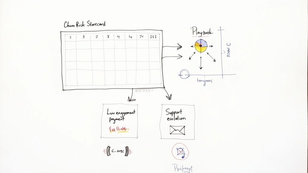
This is where Churn Risk Scorecards and Retention Playbooks come in. They are your most valuable assets in this fight.
Building Your Churn Risk Scorecard
A Churn Risk Scorecard is a simple yet incredibly effective way to flag customers before they even think about hitting the cancel button. The concept is straightforward: you assign points to various negative signals, and the total score tells you instantly who needs attention.
Think of it as an early warning system. Instead of getting blindsided by a cancellation email, you can see the red flags piling up and step in while there's still time to turn things around.
You can build this using signals you're likely already tracking:
- Declining Product Engagement: Has their login frequency dropped in the last 30 days?
- Recent Support Issues: Have they logged multiple negative support tickets this month?
- Key Feature Inactivity: Did they stop using that one sticky feature everyone loves?
- Billing Problems: Is there an overdue invoice or a recently failed payment?
Each signal gets a score. A slump in logins might be 3 points, but a failed payment is a much bigger deal—that could be a critical 5 points. When a customer's total score crosses a certain threshold, they're automatically flagged for your team to jump on.
A Churn Risk Scorecard cuts through the noise. It gives your customer success team a clear, prioritized list of accounts to focus on, making sure their energy is spent where it counts—on customers who are genuinely at risk and can still be saved.
Here’s a look at what a simple scorecard might look like.
Sample Churn Risk Scorecard
This table shows a basic scoring system to help you prioritize at-risk accounts based on key behaviors.
| Risk Factor | Description | Score (1-5) |
|---|---|---|
| Login Frequency Drop | User logins decreased by more than 50% in the last 30 days. | 3 |
| Key Feature Abandonment | The account stopped using a primary feature for over 14 days. | 4 |
| Multiple Support Tickets | More than 2 negative or bug-related support tickets filed in one week. | 3 |
| Failed Payment | A recent subscription payment failed. | 5 |
| Low Health Score | Overall health score from your CS platform drops into the "red" zone. | 4 |
This system immediately highlights who needs the most urgent attention. A customer with a score of 8 or 9 is a much higher priority than one sitting at a 3.
Creating Your Retention Playbooks
So, a customer gets flagged by your scorecard. Now what?
That’s where Retention Playbooks come in. These are just step-by-step Standard Operating Procedures (SOPs) that tell your team exactly how to handle different churn signals. No more guessing.
For every major risk factor on your scorecard, you should have a matching playbook. This creates a consistent, effective response every single time, no matter who on the team is tackling the problem.
A solid set of playbooks is the backbone of any real retention strategy. If you need help structuring these, check out our guide on creating a customer success playbook for more detailed templates and examples.
AI and the Future of Churn Diagnosis
These days, the systems for diagnosing churn have gotten incredibly sophisticated. AI and machine learning have completely changed the game, allowing companies to go way beyond simple scorecards and get far more accurate predictions.
Modern algorithms can pick up on subtle warning signs that old-school methods would miss, like a slightly negative tone in a support chat or a small change in how a user navigates your app. The best part is, they learn and get smarter over time.
By tapping into these advanced systems, you can build even more effective playbooks based on highly specific risk factors. This lets you deliver incredibly targeted and timely help.
Here’s a quick look at how you could structure a few basic playbooks tied to the scorecard above:
| Risk Factor | Playbook Action Steps | Owner |
|---|---|---|
| Low Product Engagement | 1. CSM sends a personal email highlighting a new feature relevant to their use case. 2. If no response in 3 days, trigger an in-app guide for a feature they haven't tried. 3. Schedule a 15-minute "health check" call to see how they're doing. |
Customer Success |
| Failed Payment | 1. Kick off the automated dunning email sequence. 2. After the second failure, the CSM gets a task to call the account admin directly. 3. After 4 failed attempts, temporarily suspend the account. |
Finance/CSM |
| Negative Support Tickets | 1. A CSM Manager reviews the ticket thread to understand the full context. 2. The assigned CSM reaches out personally to acknowledge the issue and confirm a fix is coming. 3. Follow up after the issue is resolved to make sure they're happy. |
Support/CSM |
Playbooks like these take the guesswork out of the equation. They empower your team to act decisively and confidently, turning your churn diagnosis process from a simple reporting tool into an active, revenue-saving system.
Your Churn Diagnosis Questions Answered
Jumping into a full-blown churn diagnosis can feel like a lot, but trust me, the most important thing is just to get started. When I talk to other SaaS operators, the same questions tend to pop up again and again. Let's tackle them head-on so you can get moving.
What Is the Very First Step to Diagnose Churn?
Before you do anything else, you have to segment your churn rate. Seriously. A single, blended churn number is basically a vanity metric—it looks simple on a dashboard, but it hides the real story.
Your first cut should always be separating Voluntary and Involuntary Churn. This one move immediately tells you where the fire is. Are customers actively choosing to leave (a product or value problem), or are their payments just failing (a billing and dunning problem)? The playbooks for fixing these are completely different, so you need to know which game you're playing.
Once you’ve done that, the next step is building customer cohorts. Group users by their signup month (like all January 2024 signups) or by their pricing plan. This is where the magic happens. You’ll quickly see if that new onboarding flow you launched in February actually moved the needle on retention three months later. Without segmentation, you’re just flying blind.
How Often Should I Perform a Churn Diagnosis?
This isn't a one-and-done project you dust off when the numbers look scary. Churn diagnosis needs to be a regular business rhythm, like a continuous health check for your company.
Here’s a good cadence that works for most teams:
- Weekly or Bi-Weekly Check-in: A quick glance at your high-level churn dashboards. You're just looking for sudden spikes or anything that seems off. This is your early warning system.
- Quarterly Deep Dive: This is where you roll up your sleeves and do a full root cause analysis. Dig into cohort reports, comb through exit survey feedback, and look for themes in support tickets. This is how you uncover the why.
The real goal is to bake this process right into your company's DNA. Make it a standing agenda item in your leadership meetings. When churn diagnosis becomes a habit, you stop reacting to fires and start proactively preventing them.
One of the biggest mistakes I see operators make is treating churn diagnosis as an annual or semi-annual event. By then, the damage is already done. A regular, disciplined review process is what separates the companies that control their churn from the ones that are controlled by it.
Can a Small Startup Really Use a Churn Diagnosis Tool?
Absolutely. In fact, you should. When you're a startup, every single customer feels a hundred times more valuable, which makes understanding churn even more critical. And no, you don't need some massive, enterprise-level platform to get going.
Honestly, the habit is more important than the tool at the very beginning. You can start scrappy with Google Sheets for cohort tracking and a simple survey tool for exit feedback.
That said, a dedicated churn and retention audit diagnosis tool is built to cut out the grunt work and get you to insights faster, which is a huge advantage for a small team. Our own tool, for example, is designed to skip the spreadsheet nightmare. It guides you through a systematic audit and uses AI analysis based on your user's inputs and data to help you make sense of your data and figure out what to do next. It’s perfect for lean teams that need to move fast.
What Is the Difference Between Forecasting and Diagnosing Churn?
This is a really important distinction. People often mix them up.
Forecasting churn is all about prediction. It answers the questions: Who might leave and when? It uses behavioral data to flag at-risk accounts so your CS team can jump in and try to save them. It’s proactive but tactical.
Diagnosing churn, on the other hand, is about understanding the past. It answers the question: Why did customers leave? It's a retrospective look at the root causes to find and fix the systemic cracks in your product, onboarding, or support. A good diagnosis informs your entire strategy.
As data researcher Dr. Zubia Mughal puts it, a model can shift from a "black-box warning system into a strategic partner" when you move from just forecasting to truly diagnosing the hidden problems. The ultimate goal is to use your diagnosis to build a better customer experience so there are fewer at-risk customers for your forecast to even find. A great churn diagnosis tool will help you do both.
Ready to stop guessing and start building a systematic process to fight churn? The playbooks and templates from SaaS Operations give you a proven framework to diagnose your churn, create effective retention strategies, and run a more efficient business. Get instant access to our churn and retention audit diagnosis tool and get an AI-powered analysis to uncover your biggest opportunities for improvement today.