Your Actionable Guide to the PMF Score Calculator
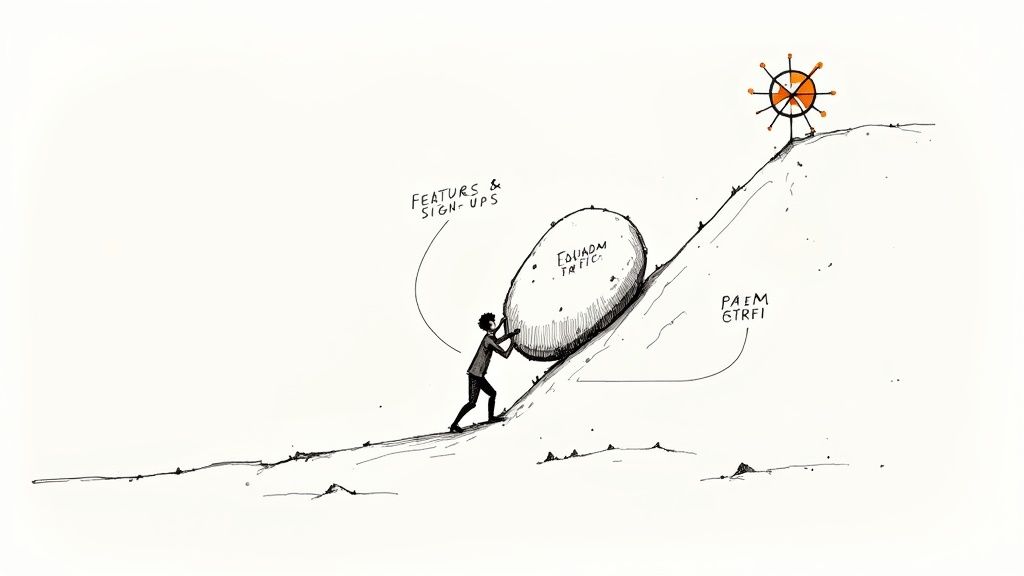
Feel like you’re constantly pushing a boulder uphill with your SaaS? You're getting sign-ups and shipping new features, but that real, sustainable growth always seems just out of reach. If that sounds familiar, it's because you're tracking the wrong metrics.
Why Your SaaS Growth Is Stuck (And How to Fix It)
This isn’t about working harder; it’s about having a clear, actionable playbook. Too many SaaS operators fall into the trap of chasing vanity metrics—website traffic, free trial sign-ups, or social media follows. Sure, those numbers look great on a dashboard, but they don’t tell you if your customers truly need your product.
They don't answer the one question that matters most: have we built something people can't live without?
This is exactly where the Product-Market Fit (PMF) score comes into play. Think of it as the single most critical health metric for your business. It cuts through the noise and gives you a brutally honest, actionable answer.
The Problem with Vanity Metrics
Relying on surface-level data creates a dangerous—and expensive—feedback loop. You see a spike in sign-ups, so you double down on the marketing that drove it. But if those new users churn after a month, you just burned a ton of cash acquiring customers who never saw the real value.
It's a frustrating cycle that leads to serious operational headaches:
- Wasted Marketing Spend: You’re pouring money into acquiring the wrong customers who were never going to stick around anyway.
- Misguided Product Roadmaps: You end up building features for the loudest complainers, not for your most loyal, high-value users.
- Team Burnout: Everyone feels like they’re running in circles, busy but never actually making progress.
Without a clear signal from your PMF score, you’re flying blind. You're guessing.
SaaS Operator Insight: "The real problem is that startups try to scale way too early. Before you have a product that a specific market segment absolutely loves, dumping money into growth is like trying to fill a leaky bucket. All your resources just drain away through customer churn."
PMF Score as Your True North
The PMF score isn't just another number on a spreadsheet; it’s a complete operational shift. It forces you to obsess over customer value and dependency above everything else. This number becomes your true north, guiding every decision you make, from your product roadmap to your marketing budget. For any SaaS Ops leader, building this metric into your regular check-ins gives you a powerful leading indicator of long-term health.
Sometimes, growth stalls not because of the product, but because of clunky internal systems. Learning how to streamline business processes with AI automation can clear up bottlenecks you didn't even know you had.
By measuring and acting on your PMF score, you’re laying the foundation for a business that doesn't just survive—it thrives. This guide will give you the tools, starting with a PMF score calculator, to finally measure what matters and unlock your company’s true potential.
Using the Sean Ellis PMF Survey: The Original Playbook
Let's get practical with the original, battle-tested way to measure product-market fit. This isn't abstract theory; it's a straightforward playbook that gets right to the heart of how much your customers actually need you.
It all boils down to a single, powerful question.
The method comes from Sean Ellis, the original "growth hacker" who helped scale companies like Dropbox and Eventbrite. He found a simple survey that could reliably predict a startup's potential. He asked customers one critical question: "How would you feel if you could no longer use our product?" The potential answers were "Very disappointed," "Somewhat disappointed," or "Not disappointed."
After analyzing hundreds of startups, he found the magic number. If over 40% of your customers pick "Very disappointed," you've likely hit product-market fit. Anything less, and you've still got work to do. This simple question works because it forces an emotional response. It’s not about satisfaction; it’s about irreplaceability.
Who and When to Survey: Your Action Plan
The secret to a useful PMF score isn't just the question—it's who you ask and when. Surveying the wrong people generates garbage data that will send you running in circles.
Your Target Audience:
- Users who have experienced the "aha!" moment: They have seen the core value.
- Users active for at least 2-4 weeks: They've had time to form a habit.
- Users who have recently used a key feature: Their experience is fresh. A good tactic is to trigger the survey in-app right after they complete a core action.
Steer Clear of These Groups:
- Brand new users: They're still kicking the tires.
- Users on a free trial: They haven't made a commitment.
- Churned customers: Their feedback is gold for understanding churn, but it will skew your PMF score.
The Calculation and the 40% Benchmark
Calculating the score is simple. You don't need a fancy calculator.
It's just simple division:
PMF Score = (Number of "Very disappointed" responses / Total responses) x 100
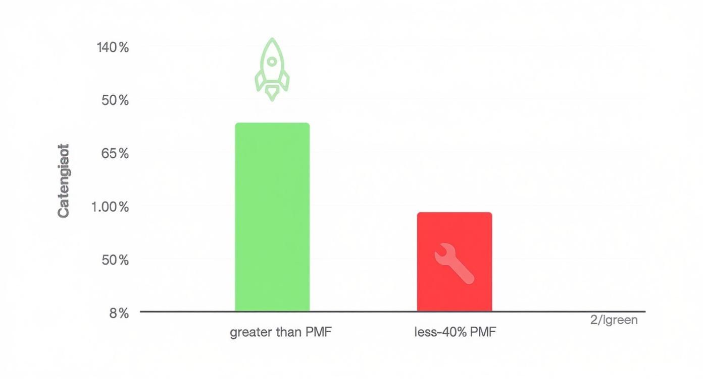
Your goal is to clear that 40% benchmark. If 40% or more of your core users say they’d be "very disappointed" to lose your product, that's a powerful signal that you're on the right track. It's the green light to step on the gas with your marketing and sales efforts.
SaaS Operator Insight: "A score below 40% isn't a failing grade; it's a gift. It's your customers giving you clear, direct feedback. It means your product is a 'nice-to-have' for most people, not a 'must-have.' Your job now is to figure out why and close that gap."
Tracking this metric shouldn't be a one-time event. It should be part of your company's operational rhythm. For more on building these kinds of repeatable processes, check out our guide on creating effective SaaS playbooks.
Interpreting Your Score: Your Next Steps
Getting the number is one thing; knowing what to do with it is another. The 40% rule is a great starting point, but the real value comes from turning your score into an immediate action plan.
Here's exactly how to interpret your results and decide what to do next.
| Sean Ellis PMF Survey Response Thresholds | ||
|---|---|---|
| PMF Score (Percentage 'Very Disappointed') | What It Means | Your Next Move |
| Above 40% | Strong PMF. You have a solid core of users who find your product indispensable. | Accelerate. Double down on what's working. Focus on growth, scaling user acquisition, and optimizing the funnel for this user segment. |
| 25% – 40% | Almost there. You're on the verge of PMF. The product is valuable, but it's not quite a 'must-have' for a large enough segment. | Optimize. Dig into the "Somewhat disappointed" group. Find out what's holding them back. Small tweaks and feature enhancements could push you over the threshold. |
| Below 25% | Needs work. Your product isn't solving a critical problem or your value proposition isn't clear enough. | Re-evaluate. Go back to basics. Conduct deep customer interviews (especially with the "Very disappointed" fans) to understand the core value. Re-evaluate your target audience and core features. |
This table should be your go-to guide every time you run a PMF survey. It turns a simple percentage into a clear, actionable plan.
A Real-World Scenario From a B2B SaaS
Let's make this real. Picture a B2B project management tool for creative agencies. They've been on the market for a year and decide to run the Sean Ellis test on users who've been active for at least six months.
They survey 100 people and get these results:
- Very disappointed: 35 users
- Somewhat disappointed: 50 users
- Not disappointed: 15 users
Their PMF score is 35%. Close, but not quite there. Instead of panicking, the Head of Ops dug into the qualitative feedback they collected. A clear theme emerged: the people in the "Somewhat disappointed" group loved the core task management, but they all complained that the reporting features were clunky and useless for sending updates to their clients.
Action Plan: The team dedicated the entire next quarter to a complete overhaul of the reporting dashboard, adding beautiful, customizable, client-facing reports.
Three months later, they re-ran the survey on a similar cohort. The results were night and day. Their PMF score shot up to 48%. That 13-point jump wasn't just a vanity metric; it was the signal they needed to unlock their next phase of growth. It gave them the confidence to pour money into acquisition, knowing that new users would find the product indispensable and stick around. That’s how you turn a simple score into a growth engine.
Measuring PMF with Retention Data: The Behavioral Proof
While surveys show how users feel, retention data shows how they actually behave. This is where the rubber meets the road. Sentiment is one thing, but cold, hard numbers prove your product is genuinely sticky.
The most powerful signal of product-market fit isn't a high survey score—it's a retention curve that flattens out over time. This is the visual proof that you've built something people can't live without.
Building Your Cohort Analysis
How do you see this in your own data? The answer is cohort analysis.
A cohort analysis groups users by the month they signed up, then tracks their activity over time. It's the best way to see if your product is getting stickier. When you see the retention percentage for a group of users stop dropping and level out, you've found your loyal, engaged base.
This is what that flattening retention curve looks like in practice. You’re looking for those later-month percentages to stabilize, not plummet to zero.
This chart tells a clear story. You can see the initial drop-off as some users churn out, but a core group sticks around month after month. That's a sign they're getting real, ongoing value from your product. A flattening curve means you’ve successfully embedded your product into your users' workflow.
Connecting Retention to Business Health
Strong retention isn't just a product metric; it's the bedrock of a healthy business model. This is where user behavior connects directly to financial viability, specifically through the LTV-to-CAC ratio.
- Customer Lifetime Value (LTV): The total revenue you can expect from a single customer.
- Customer Acquisition Cost (CAC): The total cost to acquire a new customer.
A healthy SaaS business needs an LTV that's significantly higher than its CAC. The gold standard benchmark is a 3:1 ratio. For every dollar you put into acquiring a customer, you should get three dollars back over their lifetime. A 1:1 ratio means you're burning money.
SaaS Operator Insight: "A flattening retention curve is the engine that drives your LTV. Without it, you can't build a predictable revenue model. You're just constantly trying to outrun churn, which is a battle you'll eventually lose."
For SaaS operators who want to get really granular, the next step is to dive into your net retention rate. This metric is even more powerful because it includes expansion revenue (upgrades, cross-sells), giving you a much clearer picture of your customer base's health.
The Continuous Effort of PMF
Achieving product-market fit isn't a one-and-done task. It’s a continuous loop that must be baked into your company’s operational rhythm. Markets change, competitors emerge, and customer needs evolve.
By combining the behavioral data from retention analysis with the sentiment data from surveys, you get a 360-degree view of your product-market fit. This two-pronged approach moves you from guessing to knowing, giving you the confidence to make the bold decisions that drive real, sustainable growth.
Bringing It All Together: Your PMF Score Dashboard
You've run the surveys and crunched the retention numbers, but they're likely scattered across different spreadsheets. To get a real grip on your Product-Market Fit, you need a single source of truth—a unified dashboard.
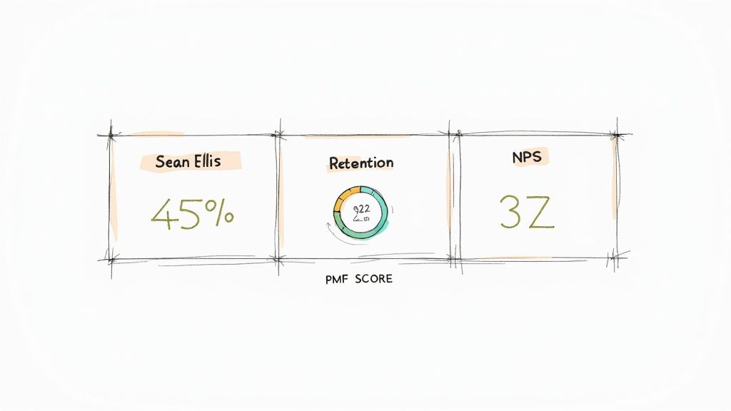
This isn’t a theoretical exercise. We've built a PMF dashboard template in Google Sheets that acts as an operational command center. It’s designed to bring your Sean Ellis survey results, cohort retention data, and NPS scores into one clean, cohesive view.
This is how you move from guessing to knowing.
Unifying Your PMF Signals
Looking at one metric in a vacuum is a classic mistake. A killer Sean Ellis score feels great, but what if your retention is bleeding users? The magic happens when you see these signals together.
The template creates a blended score, giving you that holistic, 360-degree view of your product's health. It tells the full story. For example, seeing a strong 45% Sean Ellis score next to a 50% retention rate and a 30+ NPS score is an undeniable green light. That's your signal to pour fuel on the growth engine.
To get started, plug in three key numbers:
- Sean Ellis Score: The % of users who’d be "very disappointed."
- Cohort Retention Rate: The % of a user group still active after a set time (e.g., 6 months).
- Net Promoter Score (NPS): Your gauge for customer loyalty.
Interpreting Your Blended Score
Once your data is in, the dashboard generates a blended PMF score. This isn't a simple average. It’s a weighted calculation where behavioral data (retention) gets slightly more weight than sentiment data (surveys). What users do often speaks louder than what they say.
This blended approach is crucial because a true read on PMF rarely comes from a single number. For context, retention rates hitting or passing 50% are widely seen as strong evidence of PMF. An NPS between 30 and 70 is also a great sign, pointing to a healthy balance of promoters over detractors.
The dashboard will show you exactly where you stand, instantly.
SaaS Operator Insight: "A great dashboard doesn't just display data; it forces you to ask the right questions. If your blended score is high, it's go-time. If it's low, the dashboard immediately flags the weak link. Is it sentiment? Behavior? Both?"
Weaving this PMF dashboard into your regular operational rhythm is a total game-changer. For a deeper dive, check out our guide on how to build and use business scorecards and dashboards to drive real performance.
From Dashboard to Decisions: A Playbook
Imagine a SaaS company, "SyncUp," plugs their numbers into the dashboard:
- Sean Ellis Score: 42% (Strong signal)
- 6-Month Retention: 28% (Major red flag)
- NPS: 15 (Mediocre)
The Sean Ellis score screams PMF, but the other two paint a grim picture. The dashboard makes the issue obvious: the blended score comes out low, with a flashing arrow pointing at poor retention and low advocacy.
The Diagnosis: SyncUp's product makes a fantastic first impression, but it's failing to deliver long-term value or create true fans.
The Action Plan:
- Interview Churned Users: Find out why initially excited users are leaving after a few months.
- Analyze Promoter Feedback: Dig into the NPS comments from your few die-hard fans. What makes them different? What do they value most?
- Optimize Onboarding & Engagement: Build in-app guides or lifecycle emails that show users the long-term value and make the product stick.
This is how a simple dashboard turns raw numbers into a strategic roadmap. It cuts through the noise and gets the entire team focused on a single, measurable goal.
So, What Do You Do With Your PMF Score?
https://www.youtube.com/embed/y0PMvgP3c3U
You've got your PMF score. Whether it’s a number that has the team high-fiving or a figure that feels like a punch to the gut, the score itself isn't the finish line. It's the starting gun. Now the real work starts.
That single number is your signal to stop measuring and start acting. Your next move depends entirely on where you landed, splitting your journey into two very different paths: diagnose or accelerate.
The Playbook for a Low PMF Score
A score below the 40% benchmark isn't a failure—it's a map. Your customers are telling you that you haven't quite nailed the "must-have" solution yet. Your job is to systematically figure out why.
This isn’t about guessing or throwing new features at the wall. It’s a targeted investigation focused on two critical groups from your survey.
1. Dig into the "Somewhat Disappointed" Group
This group is a goldmine. They see potential but something is holding them back. Their feedback is exactly what you need to push them over the edge.
- Action Step: Dive into their qualitative feedback. Look for common themes. Are they all complaining about a missing integration? A clunky workflow? A specific feature gap? Their answers will hand you the most actionable insights for your product roadmap. If you need help organizing this, our guide to effective feature prioritization provides a solid framework.
2. Talk to the "Not Disappointed" Segment
This might sound backward, but talking to people who wouldn't care if your product vanished is incredibly valuable. Their feedback helps you define your anti-persona—the type of user you shouldn't be building for. This prevents wasted resources trying to please everyone.
- Action Step: Reach out for a quick, 15-minute chat. You're not trying to convert them. You're trying to understand why your value proposition fell flat. You'll quickly find out if you're attracting the wrong audience or if your core messaging isn't landing.
Cashing In on a High PMF Score
If you soared past the 40% benchmark, congratulations. You've earned the right to put your foot on the gas. A high score is your cue to stop iterating broadly and start focusing with laser precision.
Your mission shifts from finding your market to dominating it. The key is to deeply understand who makes up your "Very Disappointed" group.
SaaS Operator Insight: "Your most passionate users aren't just customers; they are a living, breathing blueprint for your Ideal Customer Profile (ICP). Every single thing about them—their industry, company size, job title, and the specific problem they hired your product to solve—is a clue."
Action Step: Analyze this "Very Disappointed" group to build a razor-sharp ICP. This lets you focus your marketing and sales efforts with incredible efficiency, targeting only the prospects who look exactly like your best customers. Once you have this data, you can roll out changes aimed at boosting user loyalty and growth, often by focusing on effective customer retention strategies that resonate with this high-value segment.
This sharpens your product strategy, too. You can now confidently build features that serve this core group, knowing it will deepen their loyalty and drive more expansion revenue. You're transitioning from having a great product to building a scalable, efficient growth engine.
Got Questions About PMF Score Calculators?
Let's tackle the common questions that trip people up when they start measuring product-market fit. Here are straight, actionable answers.
How Often Should I Actually Measure My PMF Score?
Think of it as a regular health check. For an early-stage startup constantly shipping new features, measure quarterly. This gives you enough time to see if your product tweaks are making a difference.
For more mature companies with a stable product, checking in every six months or annually is fine. It’s a great way to ensure you haven't drifted away from your customers' needs.
What’s a Good Sample Size for the PMF Survey?
Don't overthink this. You don't need thousands of responses. Aim for quality, not quantity. Getting 40-50 replies from a well-defined group of your active, engaged users is usually more than enough to get a solid, statistically relevant signal.
The key is to survey the right people—users who have truly experienced your product’s core value.
Your goal isn't to build a massive dataset. It's to get a clean signal from the users who matter most. Their feedback is the real engine behind your PMF score calculator.
Can My PMF Score Drop Over Time?
Absolutely. And you should be watching for it. Product-market fit isn’t a trophy you put on a shelf; it's a living thing you have to maintain. New competitors emerge, customer expectations shift, and your product can start feeling dated.
A declining PMF score is one of the best early-warning signs you'll ever get. It’s a red flag telling you to get on the phone with customers and figure out what’s changing before it becomes a churn problem.
What if My PMF Score Is Stuck Below 40 Percent?
First, don't panic. This isn't a final grade; it's just data. A score below the 40% benchmark simply means you haven't quite nailed it yet.
Your immediate next move is to segment those survey responses. The most valuable insights are almost always hidden in the "Somewhat Disappointed" camp. These are people who want to love your product but can't. Find out why. Get them on a call and listen. Their answers are your roadmap for what to build next.
Ready to stop guessing and start growing? SaaS Operations provides the battle-tested playbooks, templates, and scorecards you need to build a more efficient and effective business. Stop reinventing the wheel and start implementing proven frameworks today at https://saasoperations.com.